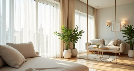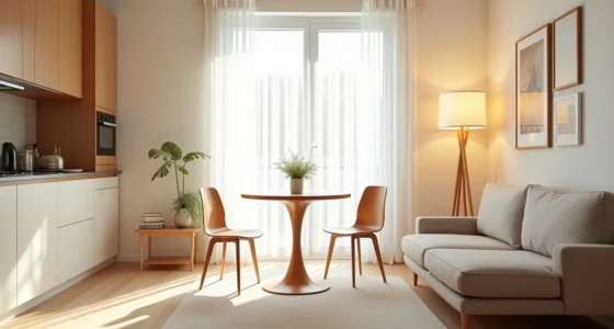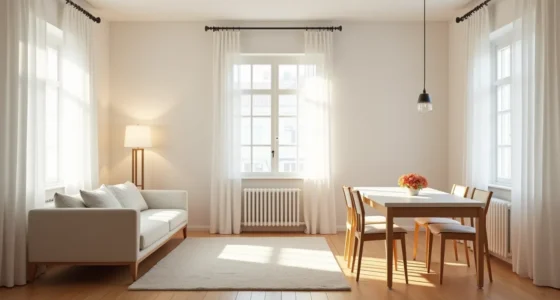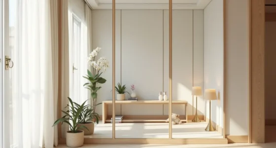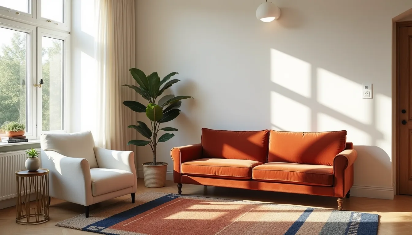
A colorful eclectic living room isn’t about decorating with everything you like, it’s about editing those likes into a deliberate balance of color, pattern, and era that still functions for daily life. It’s a curated collision of a burnt-orange boucle armchair, a tribal kilim, and a chrome arc lamp, where contrast replaces coordination. You’ll learn six distinct interpretations, each with the exact scale, material, and budget trade-offs to pull off the look without tipping into visual chaos.
Key takeaways
- Anchor bold hues with a neutral base covering at least 60% of the room’s visible surfaces to prevent visual chaos.
- Layer patterns by scale, pair a large floral with a small geometric and a medium stripe to create depth without clashing.
- Reserve white or beige for high-traffic zones like seating areas to give the eye a literal resting point between saturated walls and rugs.
- Choose renter-friendly peel-and-stick wallpaper and washable slipcovers over paint and upholstery if you need to restore the room in under two hours.
Bold Color Balance: Anchoring Multiple Hues Without Chaos
A colorful eclectic living room turns chaotic when every shade fights for attention. The fix is a deliberate hierarchy: one dominant color, two to three secondary hues, and neutral anchors that let the bold choices breathe.
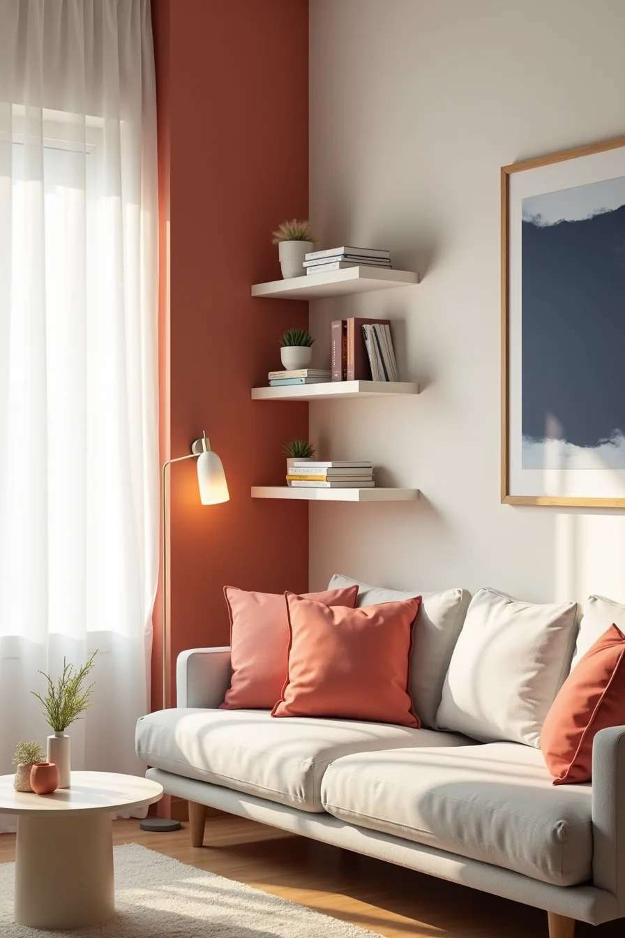
Consider a terracotta-painted accent wall as your dominant color. Against it, a pale gray sofa reads as the neutral anchor, its muted tone prevents the warm wall from overwhelming the space. Coral throw pillows introduce a secondary color that lives in the same warm family, creating visual harmony without matching.
A navy artwork piece adds a cool counterpoint, and a cream-colored floating shelf breaks up the wall’s mass while offering display space.
This approach suits medium-to-large living rooms where a single saturated wall won’t close the space in. For smaller rooms, use the gray sofa as your dominant color and relegate terracotta to pillows or a rug instead. Budget-wise, paint and removable wall decals cost significantly less than reupholstering, start there and test the balance for a few weeks before committing to pricier investments.
Pattern-on-Pattern Layering for Texture and Depth
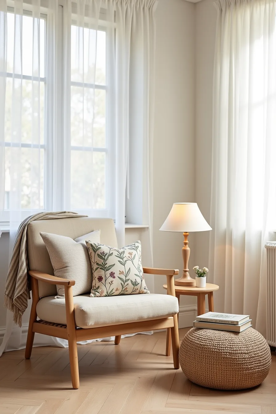
Mixing patterns works when you vary scale dramatically. A large floral print reads as a solid from across the room, so pair it with a small geometric cushion, the contrast creates depth instead of visual noise. Anchor the layout with a striped linen chair in a muted tone; its vertical lines break up the softness of the surrounding fabrics.
For this setup, drape a floral throw blanket over one arm of the striped chair, then layer a geometric cushion and a botanical print pillow on the seat. A woven pouf at the base adds a rough texture that grounds the softer pieces. Keep all patterns within two color families, warm terracotta and cream, or navy and ochre, and let the linen chair carry the neutral ground.
This approach suits medium living rooms where seating is visible from multiple angles. Limit yourself to three patterned textiles per seating group; beyond that, the eye has nowhere to rest. For rentals, swap the floral blanket and pillows seasonally, they cost less than reupholstering and let you test which combinations feel sustainable.
Neutral Breathing Space: Strategic Use of White, Gray, and Beige
A colorful eclectic living room needs neutral surfaces to prevent sensory overload. The rule of thumb: commit roughly 60 percent of your visible square footage, walls, flooring, and the largest furniture piece, to white, gray, or beige. In a small room under 250 square feet, that means every major surface stays neutral; in a large open-plan space, you can afford one saturated accent wall without tipping the balance.
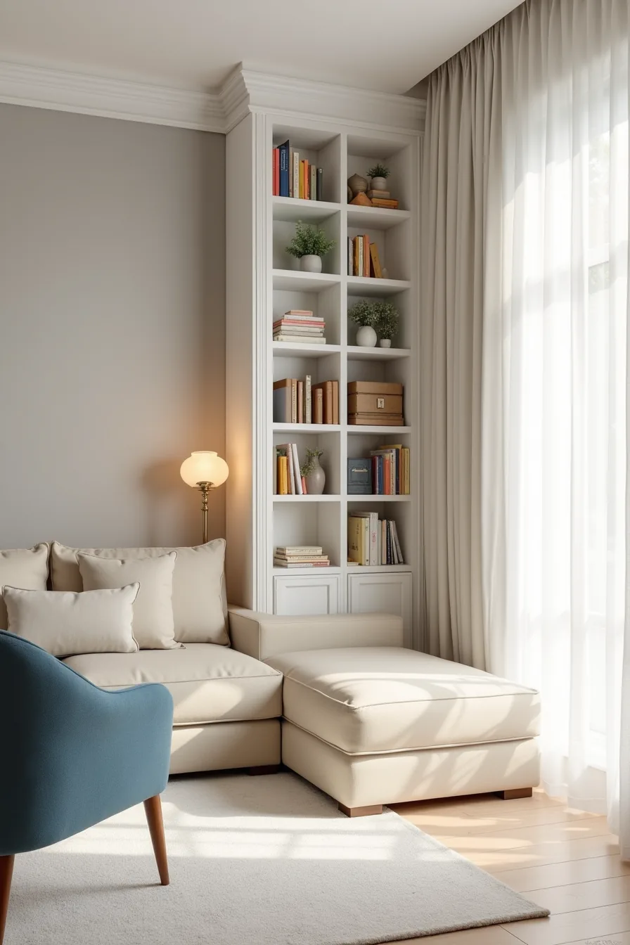
Consider the setup with a light gray accent wall, white built-in shelving, a beige linen sofa, and a soft white area rug. That neutral framework lets a single jewel-toned armchair carry the entire color story, no additional bright furniture needed. Colorful book spines and ceramic objects on the white shelving act as interchangeable art, so you can shift the palette seasonally by swapping decor rather than repainting.
This approach suits anyone who wants color without committing to saturated upholstery. Use a color duster cloth weekly on open shelving; beige linen shows dust quickly, so vacuum it with an upholstery attachment every two weeks. For renters, white or off-white area rugs stain visibly, choose a beige or light gray rug instead and layer a small colorful runner on top for the same effect with less risk.
Colorful Eclectic Living Rooms for Creative Small Spaces
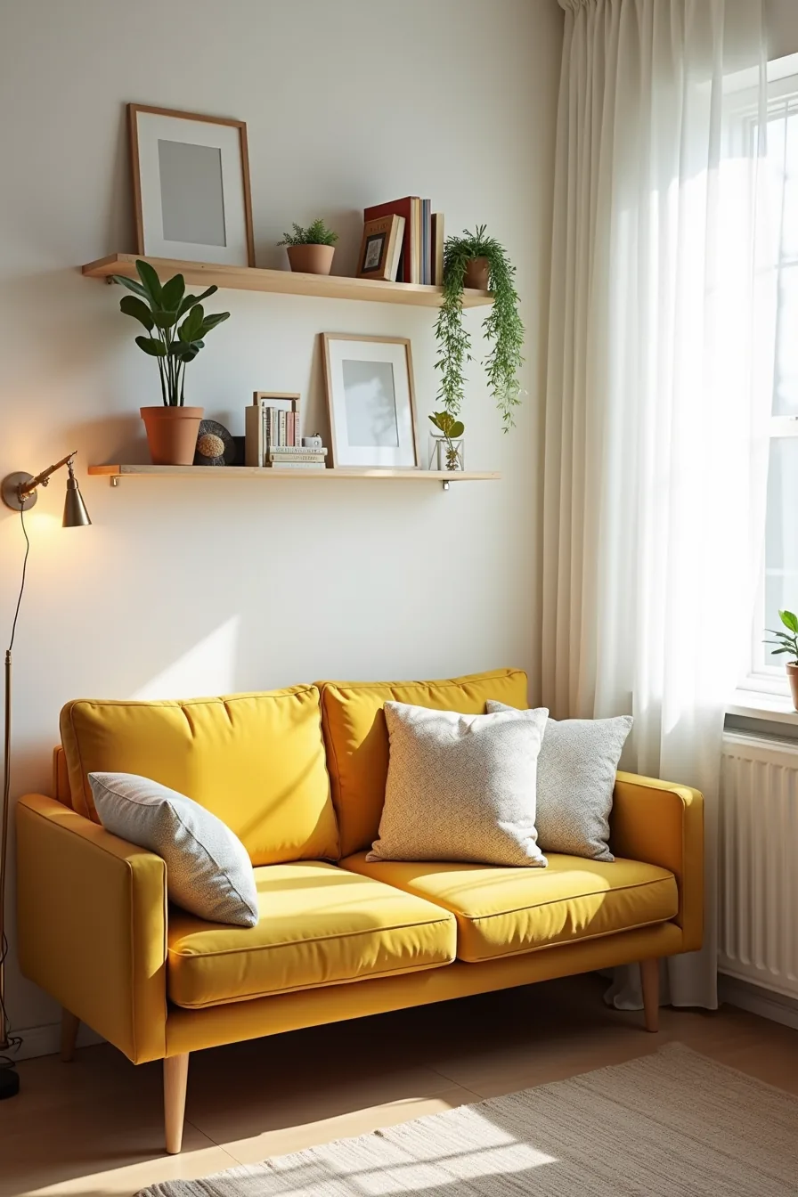
Under 200 square feet, your color strategy shifts from surface area to sight lines. A low-profile mustard yellow sofa keeps the eye moving horizontally, preserving ceiling height and making the room feel wider than it’s. Stack three to four contrasting cushions, think geometric, floral, and solid, in the same saturation level so the mix reads intentional rather than chaotic.
Mount wall shelves at eye level or higher to pull the palette upward, and keep every framed piece under 11 by 14 inches so the wall doesn’t dominate the floor plan. A compact side table no deeper than 18 inches prevents circulation bottlenecks, while a vertical string of hanging plants doubles as a room divider without consuming square footage. This layout suits a single creative professional or a couple who prioritizes entertaining over storage.
Use washable cushion covers with zippers, pet hair and spills accumulate fast in tight quarters, and dry-cleaning costs add up quickly.
Renter-Friendly Color and Pattern Solutions
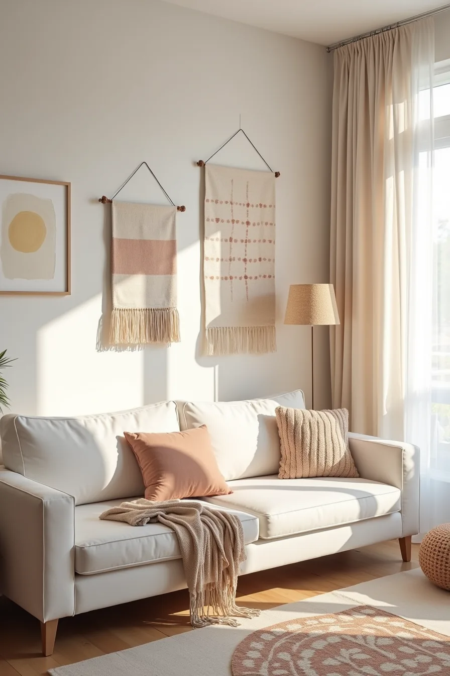
Start with a single accent wall of peel-and-stick wallpaper in a bold geometric print, it covers roughly 30 square feet per roll, removes cleanly with a hairdryer and gentle pulling, and leaves zero residue on standard painted drywall. Layer two contrasting throw rugs diagonally so the top rug’s edge sits 6-8 inches from the wall; the offset angles soften the room’s geometry and hide the rental’s beige carpet.
Drape a fabric wall hanging with tassels over a tension rod to add texture at eye level without drilling a single hole. On the rental-white sofa, cluster five to seven cushions mixing solids, florals, and ikat prints, the visual density makes the neutral base disappear. This approach suits renters on 12-month leases who want maximum impact with a weekend install and a 30-minute takedown.
Budget roughly $60-120 for the wallpaper, $40-80 per rug, and $30-50 for the wall hanging. Avoid repositioning wallpaper more than twice; the adhesive loses grip and bubbles form that are difficult to smooth out.
Investment-Grade Pieces: Durable Materials and Long-Term Color Choices
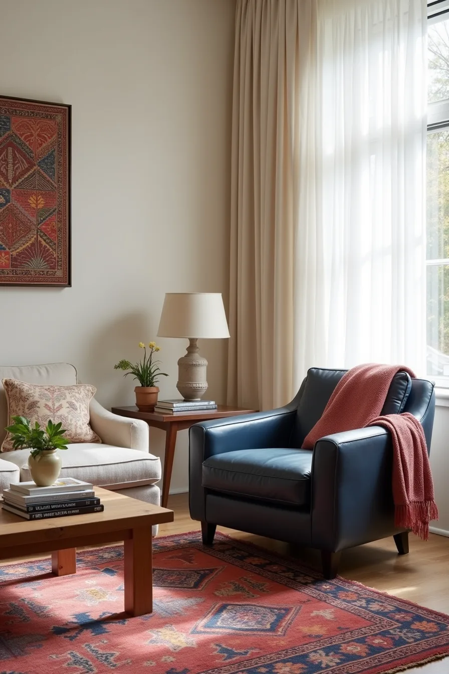
When you want color to survive a decade of sunlight and daily use, material choice matters more than hue. A high-end wool area rug in saturated jewel tones holds its dye far longer than a cotton or polypropylene alternative, wool’s natural lanolin coating resists fading and stains, and most quality rugs last 20-30 years with proper rotation every 6-12 months. Pair it with a leather armchair in deep indigo; full-grain leather develops a patina rather than looking worn, though you’ll need to keep it 3 feet from direct sun exposure to prevent uneven bleaching.
For a vintage Turkish kilim throw, expect natural dyes to soften gradually rather than fade abruptly, this is a feature, not a defect. A museum-quality framed textile art piece adds color without absorbing UV damage the way painted canvas might, provided you use UV-filtering glass (typically 97-99% protection). Solid wood side tables in walnut or oak anchor the scheme and require only occasional oiling to maintain their warm undertones.
Budget $800-2,500 for the wool rug, $700-1,800 for the leather chair, and $200-600 for framed textile art, this route suits homeowners who prefer buying once over replacing seasonally.
Your First Move
A colorful eclectic living room rewards restraint as much as boldness. Pick one anchor piece, a patterned sofa, a vintage rug, or a gallery wall, and build everything else around it. That single decision prevents the chaos that turns eclectic into cluttered.
Start with the largest surface you already own. If it’s neutral, add color through textiles and art you can swap seasonally. If it’s already loud, keep surrounding pieces quiet for balance.
Measure your room’s longest wall before buying anything oversized. Then commit to one accent color that appears at least three times across different objects. That repetition is what makes eclectic look intentional rather than accidental.
Frequently Asked Questions
How much neutral color should a colorful eclectic living room have?
Keep neutrals to roughly 30–40% of the room’s visible surfaces, floor, large sofa, or walls. This anchors the color and prevents visual noise. Use warm greige, cream, or tan rather than stark white for a softer contrast.
Can you use more than three colors in a colorful eclectic living room without it looking chaotic?
Yes, if you follow a 60-30-10 ratio: one dominant color, one secondary, and two to three accent hues. Repeat accents in pillows, art, and rugs at least twice each. Avoid equal color blocks, which fragment the space.
What’s the best way to add color to a colorful eclectic living room if you rent and can’t paint?
Use peel-and-stick wallpaper on one feature wall, removable vinyl floor decals, and large framed fabric panels. Layer colorful throw pillows, a patterned rug, and slipcovers. All reverse without damage, and you can take them to your next home.
How do you prevent a colorful eclectic living room from feeling dated or trendy?
Anchor the palette with timeless shapes, mid-century or organic-modern furniture, and buy colorful pieces you’d keep for a decade. Avoid neon or single-season motifs. Swap small accents like pillows or lamps seasonally, not the core furniture.