A colorful living room isn’t a single look, it’s a spectrum of decisions, from a single saturated wall to a gallery of patterned textiles, and the right choice depends entirely on your space, budget, and tolerance for change. You can commit to a permanent statement or build a palette you can swap out in an afternoon. Each approach demands different materials, maintenance, and money, so knowing your constraints before you pick a paint chip or a pillow saves you from costly rework.
Below are six concrete routes, each with the specific trade-offs you need to match a look to your life.
Key takeaways
- Choose your anchor: A colored sofa or built-in cabinetry suits long-term owners, while painted walls or textiles give renters and budget-focused decorators the same impact without commitment.
- Color-block with function: Use a bold hue on the wall behind a console or reading nook to define the zone, keeping the remaining walls neutral so the room doesn’t feel smaller.
- Balance an accent wall by repeating its color in at least two smaller elements, like pillows or a rug, else the single painted surface will visually tip the room off-center.
- Budget refreshes work best with a 60-40-20 split: 60% neutral base, 40% your main color in textiles, and 20% a contrasting accent, this prevents the space from looking chaotic without repainting or buying new furniture.
Bright Walls vs. Bright Furniture: Which Approach Suits Your Space
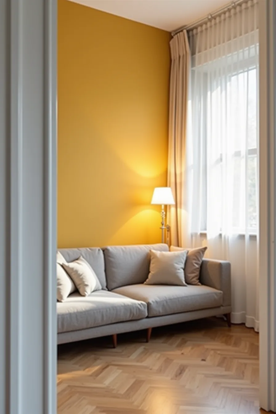
The core decision comes down to commitment level and square footage. Paint is temporary, forgiving, and costs roughly $50–$150 per wall in materials; a colored sofa typically runs $800–$3,000 and will anchor your scheme for a decade. In a compact studio, that trade-off favors paint.
Picture a low-profile gray sectional with neutral cushions occupying the center of the room, the upholstery recedes, while a single mustard-yellow wall behind it does the heavy lifting. The opposite wall stays white to reflect light, and the window frame remains uncluttered, so the bold color reads as intentional rather than chaotic.
This approach suits renters (paint can be repainted before move-out) and small-space dwellers who can’t afford a bulky colorful piece. It fails in large, open-plan rooms where a single painted wall gets visually lost; there, colored furniture becomes necessary to distribute weight across the space. Commit to paint for low-stakes experimentation, furniture for permanence.
Color-Blocked Rooms: Creating Visual Zones Without Overwhelming the Space
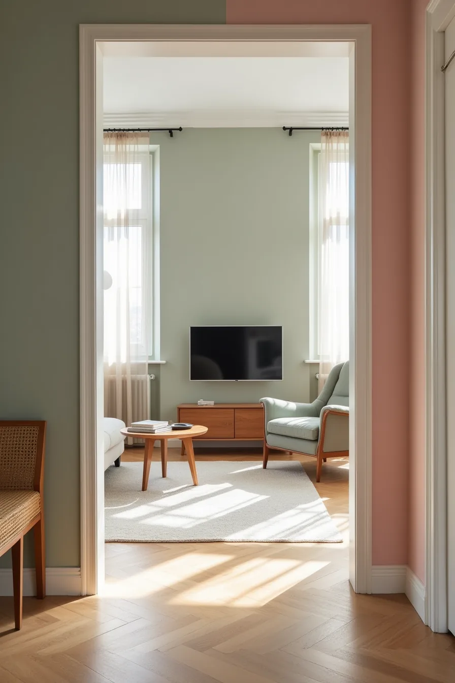
Color-blocking splits a room into functional zones, each with its own hue, so you get complexity without visual chaos. In a medium living room, assign sage-green walls to the entry side with a woven bench, keep the center in soft gray around a wooden media console, and finish the right third in blush-pink behind a velvet accent chair. Three distinct rugs, one per zone, anchor each area and prevent the boundaries from feeling arbitrary.
This works because the three tones share a muted, dusty saturation, which creates cohesion despite different hues. It suits medium to large rooms where you need to define separate functions, seating, media, reading, without building physical dividers. You’ll need approximately 3–4 gallons of paint for three walls (around $90–$180 total) and a weekend of taping and cutting in.
Skip this if your room receives uneven natural light; a dark corner will muddy the sage, while direct sun can wash out the blush. For renters, use large peel-and-stick panels or freestanding room dividers painted in the same scheme instead of committing to permanent wall color.
Accent Wall Strategies That Actually Balance a Room
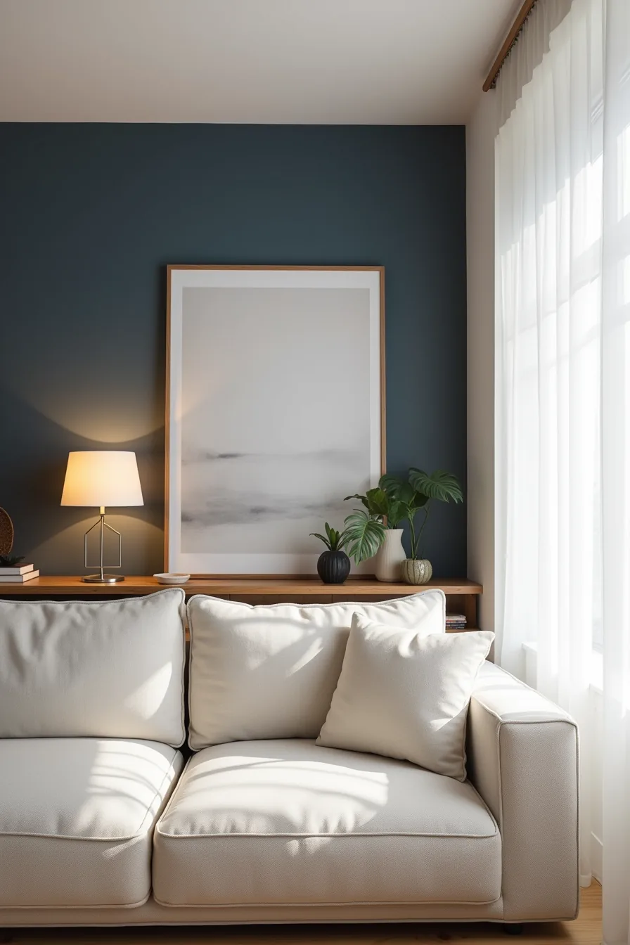
Choose your darkest accent wall based on where the room’s natural light originates, not on which wall you see first from the doorway. Position the accent wall perpendicular to your main window, direct sunlight will create glare on deep pigments, while a wall that receives only ambient light lets the color read as rich rather than harsh. The navy wall described here works because the side window grazes it at an angle, producing subtle depth shifts across the surface instead of a flat, darkened plane.
Keep the three remaining walls in soft white and mount your shelving unit so it occupies roughly 60–70% of the accent wall’s width, centered. This proportion leaves enough navy visible to register as intentional while preventing the furniture from visually swallowing the color. Hang the abstract painting at eye level, typically 57–60 inches from floor to the piece’s center, so it pulls the eye upward and balances the linen sofa’s low profile in the foreground.
The neutral sofa is non-negotiable here; a patterned or colored sofa would compete with the accent wall for dominance, and the room would lose its focal hierarchy. Expect to spend $50–$100 on a gallon of quality navy paint plus primer, and budget four to six hours for prep, taping, and two coats.
Playful but Cohesive: Mixing Multiple Colors Without Clashing
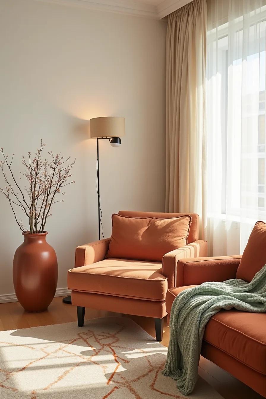
The terracotta wall, ochre armchair, sage throw blanket, and rust ceramic vase all coexist because they share a warm undertone, even though the sage leans cooler. That shared warmth is your anchor; without it, the palette fractures into disconnected accents. To check your own scheme, hold fabric swatches together in daylight, if any hue feels like it belongs to a different family, swap it for a sibling tone.
Apply the 60-30-10 rule here: the terracotta wall claims 60% of the visual weight, the ochre armchair and cream-and-rust geometric rug cover roughly 30%, and the sage blanket plus vase take the final 10%. The rug bridges the two large surfaces by repeating both the rust and cream, so the eye moves fluidly instead of jumping. Limit yourself to four hues maximum, and let one dominate by covering the largest surface area, usually a wall or sofa, to keep the room playful but cohesive rather than chaotic.
Colorful Living Room Ideas for a Budget Refresh Using Textiles and Accessories
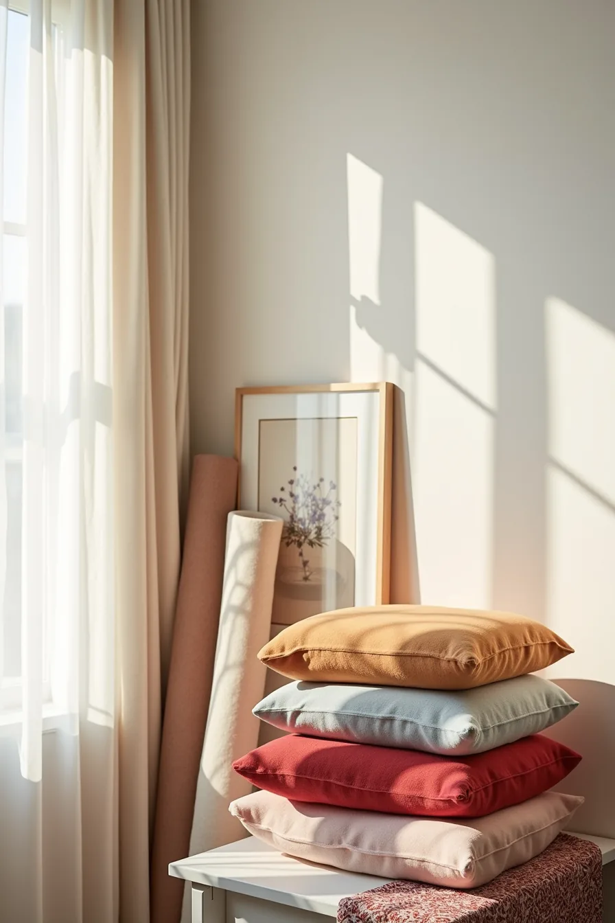
Start with a neutral anchor, your existing wall color or sofa, then layer in color exclusively through items you can swap in an afternoon. A stack of jewel-tone throw pillows in velvet or woven cotton introduces saturated color without touching a paint can; expect to pay $15–40 per pillow cover, and choose removable cases so washing or swapping is effortless.
Restyle the same corner with a rolled linen curtain panel, even if it never reaches a rod, draping it over a side table adds texture and a color block that reads as intentional. Lean a framed abstract print against the wall rather than hanging it, which costs nothing to rearrange and lets you test a palette before committing to a frame layout. Fold a patterned area rug over the edge of a side table to preview how its colors work with your pillows and print, all while keeping the floor clear.
For renters, this route is ideal: no paint, no hardware, and every piece fits in a laundry basket when you move. Keep your color family tight, pick pillows that echo one hue from the rug, to avoid scattering the eye across unrelated accents.
Long-Term Investments: Colored Sofas, Cabinetry, and Built-Ins That Anchor Your Scheme
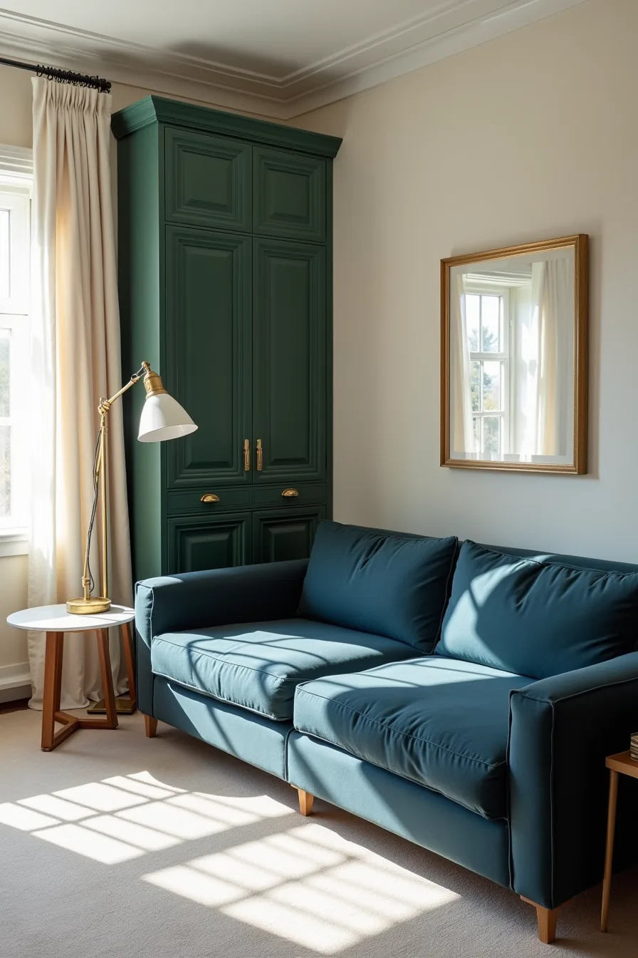
A deep-blue upholstered sofa is the highest-use color purchase you can make, but only if the fabric is performance-grade. Look for Crypton or solution-dyed acrylic blends with a rub count above 30,000, those withstand daily use for a decade without visible fading or pilling. Position it as the room’s anchor, then let forest-green cabinetry with brass hardware create a secondary color block that frames the sofa rather than competing with it.
Built-ins justify their cost through function and permanence: painted cabinet doors cost $200–600 per linear foot installed, but they eliminate the need for separate shelving and storage furniture. Pair them with a marble-topped side table and a brass floor lamp to introduce cool neutrals that keep the blue-and-green scheme from feeling heavy. This approach suits homeowners with a 5–10 year horizon who want a cohesive backdrop, muted artwork and brass accents ensure the palette stays adaptable when you eventually rotate textiles or accessories.
Your next move
Colorful living rooms fail when color gets added without a plan for scale, upkeep, or rental constraints. You now have six distinct routes, choose the one that matches your space size, budget, and how long you plan to stay. Each approach works, but only if you commit fully rather than mixing three of them at once.
Start tonight by collecting paint swatches or fabric samples in your three target colors and tape them to your wall. Live with them for 48 hours before buying anything. That single step prevents most costly color mistakes.
Frequently Asked Questions
How do I know if my living room is too small for bold colors?
Small rooms handle bold colors fine, provided you limit them to one feature wall or large furniture piece. Avoid painting all four walls saturated hues; instead, test with large swatches for three days and view them at different times of day.
Can I use colorful living room ideas in a rental without losing my security deposit?
Yes, if you stick to removable solutions. Use peel-and-stick wallpaper, washable slipcovers, area rugs, and removable adhesive tiles. Skip painting walls unless your lease explicitly permits it, and always photograph the original condition before installing anything.
What’s the safest way to mix warm and cool colors in one room?
Anchor the room with a neutral base, white, greige, or warm gray, then add warm accents (terracotta, ochre) on one side and cool accents (teal, blue) on the opposite. This prevents visual clash. Aim for a 60-30-10 ratio: neutral, dominant color, accent color.
Should I paint the ceiling a different color than the walls?
Yes, if you want to visually lower a tall ceiling or add intimacy. Use a color two to three shades darker than the walls. For standard 8-foot ceilings, stick to a lighter or same-family tint to avoid making the room feel boxed in.