
A colorful living room isn’t one look, it’s a spectrum of strategies that balance pigment with practicality, and the right approach for you depends on your space, budget, and how long you plan to stay. Six distinct routes exist, from a renter-friendly peel-and-stick accent wall to a permanent two-tone millwork investment. Each delivers a different commitment level, maintenance load, and visual payoff.
Below, you’ll match the method to your room’s proportions, your lease terms, and your tolerance for repainting. The decision tree starts with one honest question about your walls.
Key takeaways
- Start with three colors: choose one dominant neutral (60%), one secondary color (30%), and one accent (10%) to keep the palette cohesive without chaos.
- Anchor with a bold sofa: invest in a single saturated piece in jewel tones like emerald or mustard, then let walls and accessories stay muted to avoid visual overload.
- Use removable wallpaper or paint one wall: for renters, a peel-and-stick feature wall behind the TV or sofa delivers color without permanent changes, costing roughly $30–$100 per roll.
- Scale color to room size: in small spaces, limit bold hues to textiles and a single accent chair; in large rooms, distribute color across three zones (seating, shelving, and floor) to prevent a sparse or overwhelming feel.
The Three-Color Palette Foundation
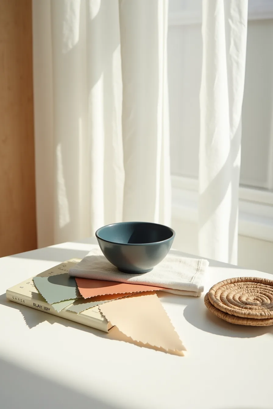
A colorful living room rarely fails because of the hues you choose; it fails from a lack of structure. The most reliable structure is a three-color palette: one dominant neutral, one primary color, and one accent. This trio creates cohesion and prevents the space from feeling chaotic or visually exhausting.
A flat lay of three paint swatches, deep navy, warm terracotta, and soft sage, paired with a cream linen fabric swatch, a small navy ceramic bowl, and a woven natural fiber coaster demonstrates the principle perfectly. The cream grounds the palette; navy carries the weight; terracotta and sage supply warmth and life.
For a living room, apply this as roughly 60% neutral (walls, large upholstery), 30% primary color (rug, curtains, a sofa), and 10% accent (cushions, ceramics, art). This ratio is a guideline, not a law, shifting to 50/40/10 works if you prefer a more saturated look. The key is that your accent color appears at least three times in the room, so it reads as intentional rather than accidental.
If your palette feels flat, increase the accent’s presence before you add a fourth color; a fourth hue is the most common reason a collected look turns cluttered.
Bold Sofa as Your Color Anchor
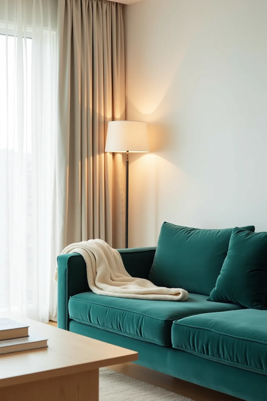
A jewel-toned velvet sofa answers the bold sofa or bold walls? Question decisively: the furniture carries the color, and the walls stay quiet. An emerald or sapphire piece against white walls creates focus without the permanence of painted surfaces, recover the sofa in a few years and the room transforms entirely.
The velvet texture matters as much as the hue; it catches light and gives the color depth that flat cotton can’t.
Scale determines whether the sofa anchors or overwhelms. In a standard 12-by-15-foot living room, a three-seater between 78 and 90 inches wide leaves enough floor space for circulation and a coffee table. Pair it with a cream throw draped over one arm to soften the color block, neutral linen curtains behind to frame it, and a light wood coffee table in front for contrast.
This setup suits anyone who wants maximum impact with minimal styling effort, the sofa does the work, and the surrounding neutrals ensure it reads as deliberate rather than loud. Budget for the long term here: a quality velvet sofa runs $1,500 to $4,000, but it replaces the need for colorful rugs, art, or accessories.
Feature Walls Without Commitment
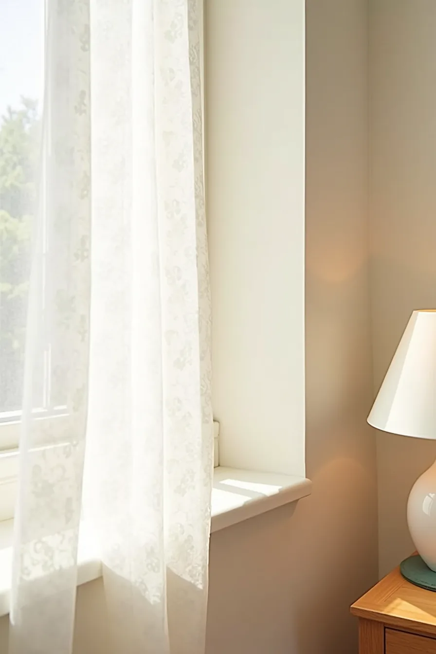
Removable wallpaper delivers the color-blocking effect of a painted accent wall with zero sanding, priming, or landlord negotiations. The seam edge where the paper meets your neutral wall paint becomes a deliberate design line rather than a flaw, choose a geometric or botanical pattern that stops at a natural boundary like a corner or door frame. Modern peel-and-stick papers use a low-tack adhesive that releases cleanly after years of use, though textured walls require a smooth, primed surface or the paper will show every bump.
A single 12-foot wall typically takes two to three hours to install, and you might need 40 to 50 percent more paper than the square footage suggests to match the pattern at seams. The botanical print against plain wooden baseboard and corner trim reads as intentional wallpaper, not a compromise, so even a temporary rental gains permanent-looking character. This route suits renters and design skeptics alike: it costs $8 to $15 per roll, reverses completely, and lets you test a saturated pattern without the financial or emotional commitment of paint.
Beyond the wall itself, keep the rest of the room neutral so the patterned surface, not the accessories, carries the visual weight.
Color With Breathing Room
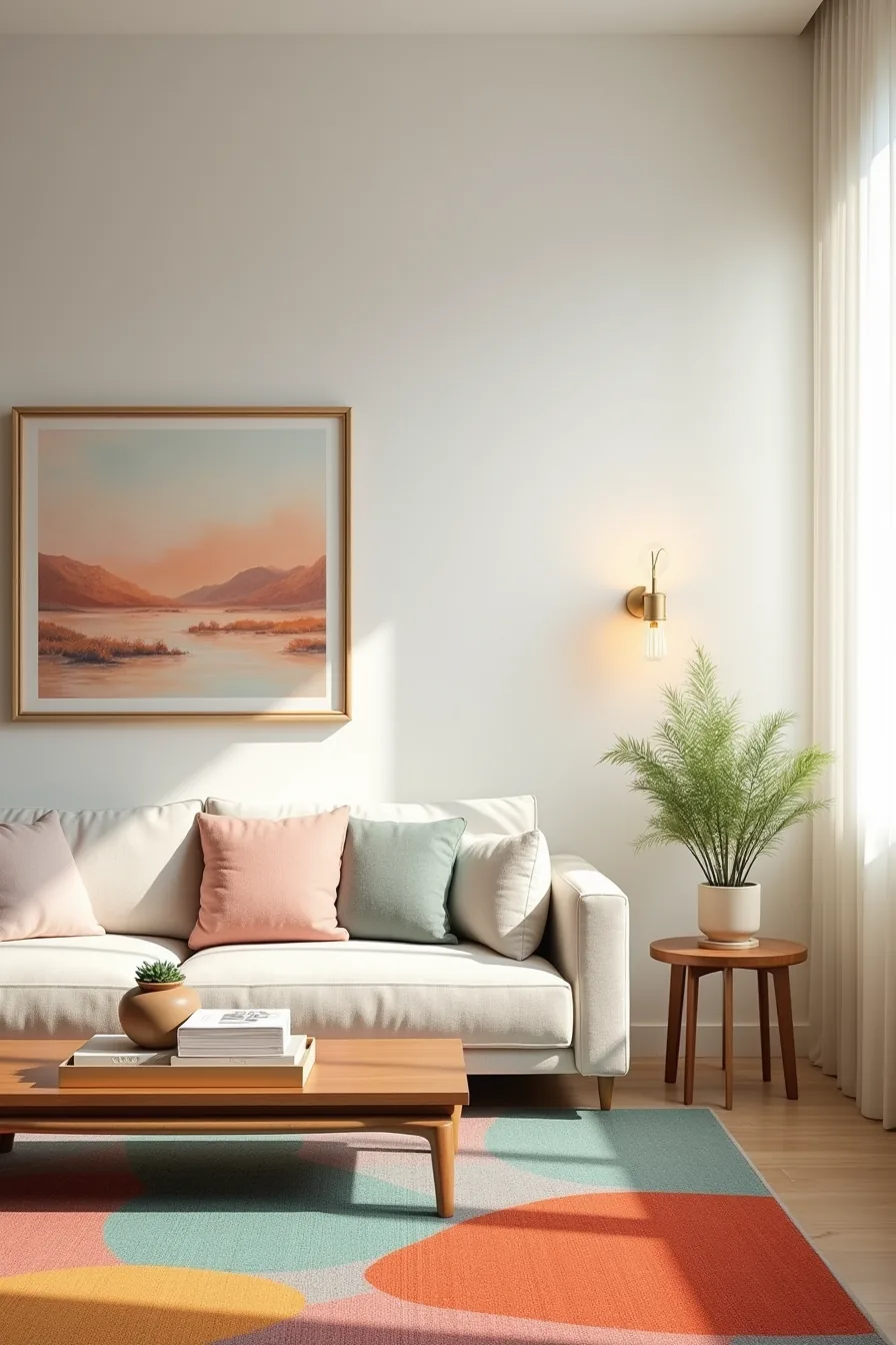
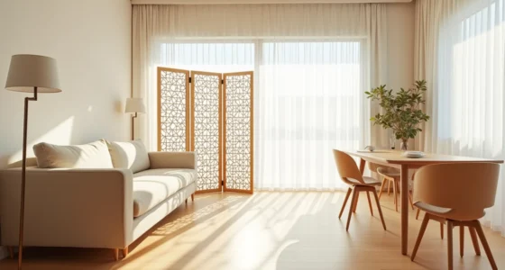
Color reaches maximum impact when it occupies only 10 to 15 percent of your visual field, leaving the rest of the room to do the quiet work of framing it. A mostly neutral living room, ivory walls, a light linen sofa, lets a single coral, teal, and ochre abstract rug do the heavy lifting, anchoring the seating area without bleeding into every corner. Let that rug set the palette, then pull one warm-toned framed landscape onto the wall above the low wooden table, and place a potted plant on the side table for a natural counterpoint.
This approach suits anyone who wants color without sensory overload, especially first-time decorators still defining their taste. The trade-off: you must keep surrounding furniture disciplined, with plain textures and muted tones, or the effect fragments. Leaving ample empty wall space around the painting gives the eye a resting point, which makes the artwork read as intentional rather than accidental.
Grown-Up Colorful Living Rooms
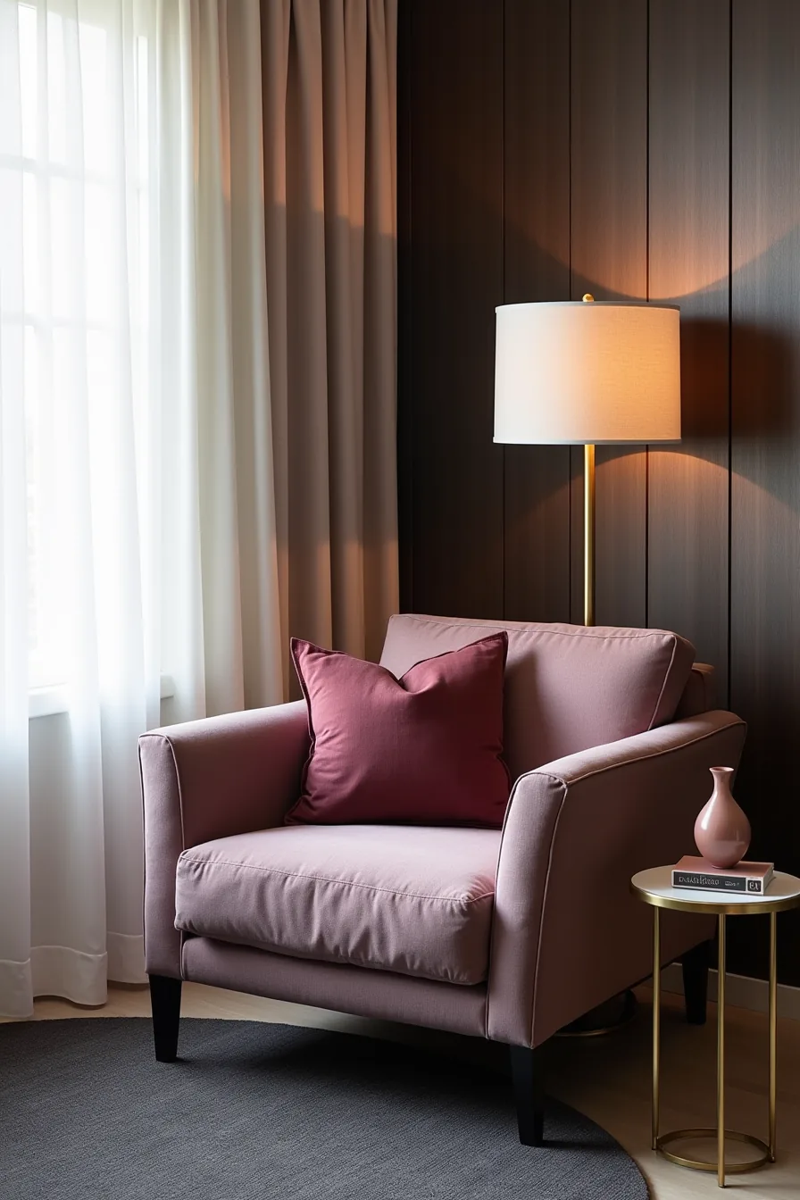
Muted, complex palettes are how you get color without the circus. The difference is tonal depth: instead of primary reds and blues, you work with plum, burgundy, dusty rose, and charcoal, colors that carry gray or brown undertones and feel quieter in a room.
A muted plum-toned sofa reads sophisticated precisely because it refuses to shout. Pair it with a jewel-toned burgundy linen pillow, and you get contrast without clashing, since both colors share a red ancestry at different saturations. The deep charcoal area rug grounds the seating area, preventing the plum and burgundy from floating visually.
A brass floor lamp with a linen shade adds warmth and a subtle reflective quality, while a small brass side table holding a ceramic vessel in dusty rose completes the composition. These accent pieces work because they echo the sofa’s undertones rather than introduce a new palette.
This approach suits professionals, renters with beige walls, or anyone who finds white-and-gray interiors sterile but fears full saturation. The maintenance trade-off: jewel-toned linens and brass fixtures both show dust and fingerprints, so budget for weekly wiping and expect to launder pillow covers every two to three months. Dark wood paneling or a deep wall color behind the sofa anchors everything further, but if you can’t paint, a large framed art piece in charcoal and rust will achieve the same effect.
Scaling Color Across Room Sizes
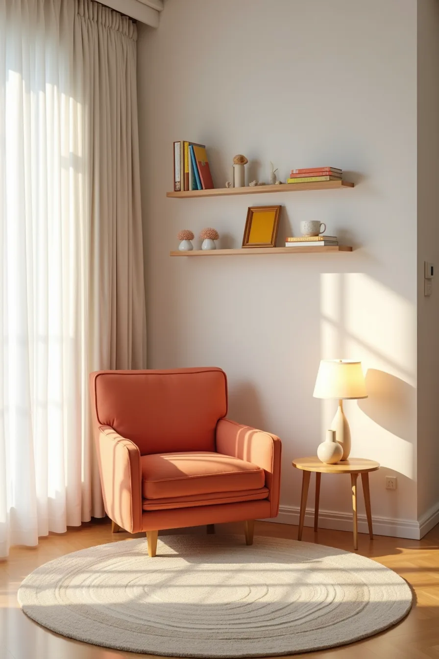
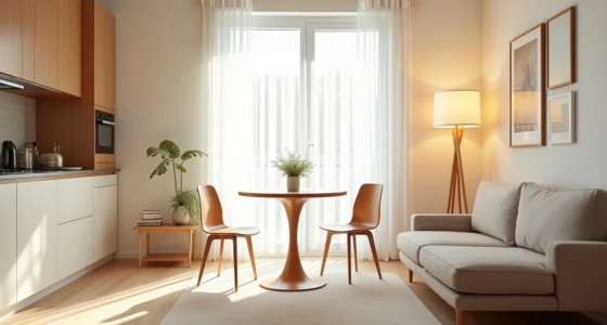
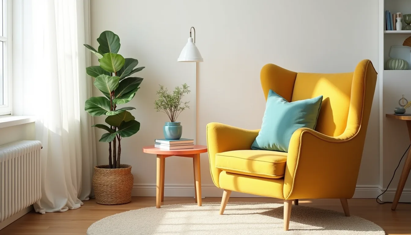
Small spaces demand a different ratio of color to neutral. In a compact living room, a coral or mustard accent chair (roughly 30–34 inches wide) provides the visual anchor; adding a second saturated piece in the same zone will begin to crowd the eye. A narrow striped rug, keep it under 5 feet in width, defines the seating area without swallowing the floor, while floating shelves carry three colored objects spaced apart with at least four inches of breathing room.
The low-profile side table, no taller than 18 inches, keeps the visual line clean and prevents the color from stacking vertically.
For medium rooms, scale up by repeating the accent color three times across different heights: a throw on the sofa, a vase on the console, a mat under a plant. Large spaces can handle a full saturated wall or a sectional in a bold hue, but you must distribute neutrals generously to keep the color from becoming a void. The common failure in big rooms is undersized accents, one small chair in a 20-foot expanse reads as an accident, not a decision.
Where to start
Choose one anchor piece first, a sofa, rug, or feature wall, and build your palette around it. Keep 60-70% of the room in neutral tones, then layer the remaining 30-40% with your chosen colors across textiles, art, and accessories. This ratio prevents the space from feeling chaotic while still delivering visual impact.
Start with a single cushion or throw in your preferred shade and live with it for a week. If it still feels right, commit to the larger pieces. This low-risk test costs under $50 and saves you from repainting or reupholstering after a costly mistake.
Frequently Asked Questions
Should I paint walls or buy a colored sofa first when building a colorful living room?
Start with the sofa. It anchors the room’s scale and function, so choose its color first, then pull two to three wall tones from that upholstery. Painting after lets you match precisely without repainting.
How do I prevent a colorful living room from feeling chaotic or childish?
Limit yourself to three dominant colors plus one neutral. Use large blocks of color on walls or a sofa, then keep smaller accents (pillows, art) within that palette. Muted or deepened tones, olive, rust, navy, read mature, not primary.
What’s the best way to add color to a rental living room without losing your security deposit?
Use peel-and-stick wallpaper on one accent wall, tension rods with colorful curtains, and removable vinyl decals. Add color through area rugs, slipcovers, and floor lamps. All reverse in under an hour without paint or holes.
How much white or neutral space should I leave in a colorful living room?
Reserve 30–40% of visible surface area for white, cream, or light gray. This includes walls, ceiling, and large furniture like a sofa or rug. That neutral buffer prevents visual fatigue and makes each color pop more distinctly.