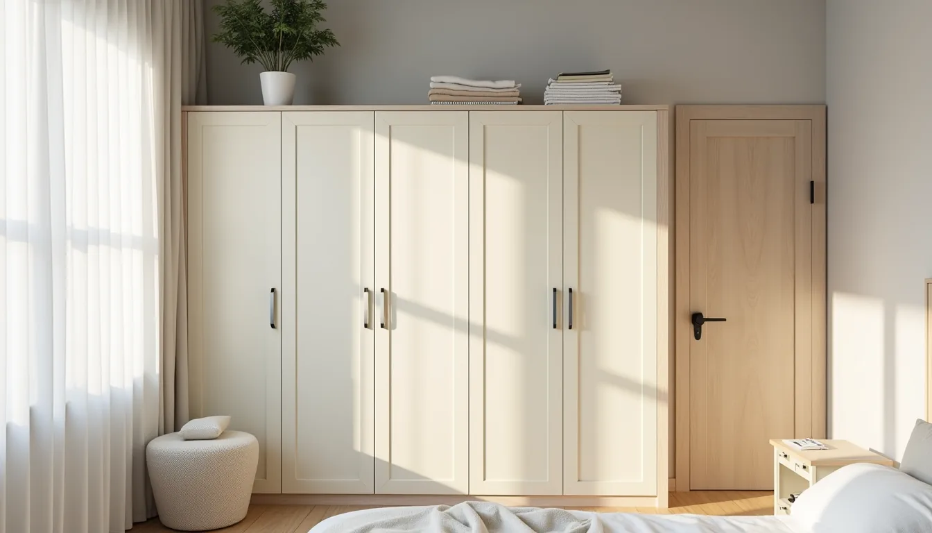
Choosing the right bedroom wardrobe colour combination does more than match your walls, it sets the room’s perceived size, light levels, and daily mood, yet most people pick a shade before measuring their floor space or checking their ceiling height. A dark, floor-to-ceiling unit in a 10-by-10-foot room will swallow daylight and make the space feel like a cave, while a pale, high-gloss front in a large, sun-drenched bedroom can feel stark and uninviting. The real work is pairing your colour choice with your room’s proportions, your lighting, and how you actually use the storage, so before you commit to a finish, you need to know which combinations shrink, expand, or anchor a space.
The six approaches that follow give you a decision-ready framework for every budget and rental situation.
Key takeaways
- Tone-on-tone neutrals suit medium-to-large bedrooms best, as they rely on subtle depth from matte and lacquered finishes rather than contrast to define the wardrobe’s silhouette.
- Wood plus painted doors delivers a cost-effective, long-term look; pair a standard oak or walnut frame with a single painted panel in a warm off-white to achieve the mixed-warmth effect without custom joinery.
- Light-versus-dark contrast works only when the wardrobe occupies less than 40% of the wall; on a full-wall unit, the stark split will visually shrink the room and create a jarring focal point.
- Renter-friendly routes favor peel-and-stick film or removable chalkboard paint on the doors, both of which cost under $50 for a standard 6-foot wardrobe and lift off without damaging the original finish.
Tone-on-Tone Wardrobe in Soft Neutrals
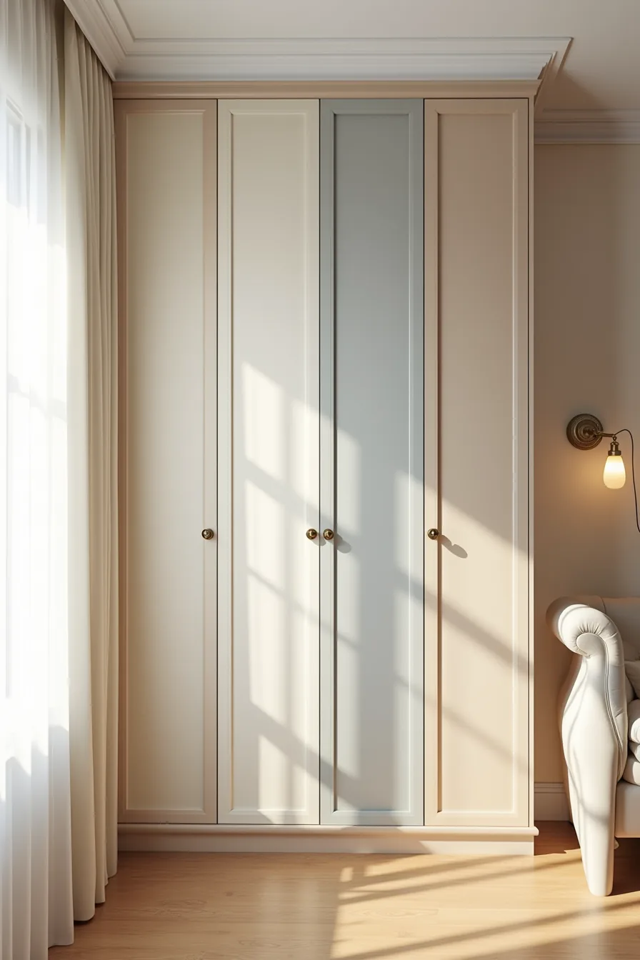
A tone-on-tone wardrobe layers three to four shades from a single colour family across the doors, frame, and hardware. The graduated cream, taupe, and grey panels in this built-in unit create subtle visual shifts that read as quiet sophistication rather than contrast. Brass knobs on each door add a warm metallic punctuation that stops the scheme from feeling sterile.
This approach works best in small bedrooms because low-contrast colour fields trick the eye into reading the wall and wardrobe as one continuous surface, making the room feel larger. It suits anyone who wants a calm, hotel-like atmosphere or who works with a north-facing room where strong hues can feel heavy. Reproduction requires ordering matched panels from the same supplier, off-the-shelf doors rarely align perfectly across shades, and budgeting 10-15% more than a single-colour finish for the extra painting or laminating steps.
Dust shows quickly on flat matte neutrals, so plan for a weekly wipe-down with a dry microfibre cloth to keep the tonal shifts crisp.
Wood Plus Painted Doors for Mixed Warmth
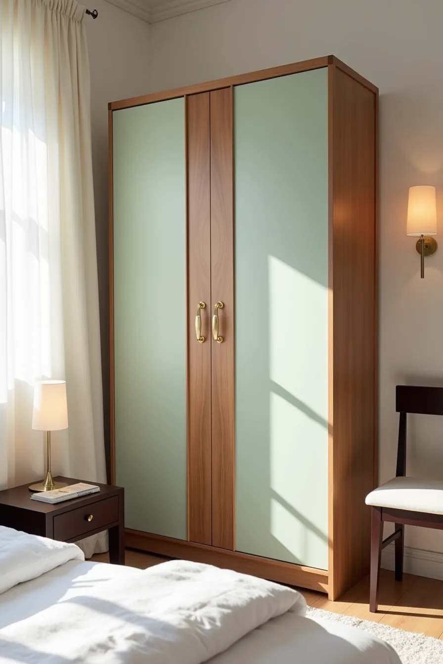
This combination pairs a natural wood frame with painted door panels in a complementary shade. The freestanding walnut frame gives the wardrobe heft and visual weight, while the sage-green painted doors bring lightness, two elements that balance each other rather than compete. Gold handles tie the two materials together with a unified metallic detail.
It suits medium to large bedrooms where an all-wood piece would dominate the room and an all-painted piece would read as too sparse. The visual rhythm is essential here: two painted door panels flanking a natural wood central section breaks the mass into thirds, preventing the furniture shape from feeling monolithic. This layout also lets you test a colour trend without committing a full unit to it.
Reproduction costs are moderate, expect to pay 15-20% more than a standard painted finish and paint the doors before installation to avoid overspray on the hardwood. Refresh the painted sections every five to seven years; the wood side only needs periodic oiling. Choose paint with a satin sheen for wipeable surfaces, and keep hardware in the same finish family as the room’s other metal accents to maintain cohesion.
Light vs Dark Contrast for Definition
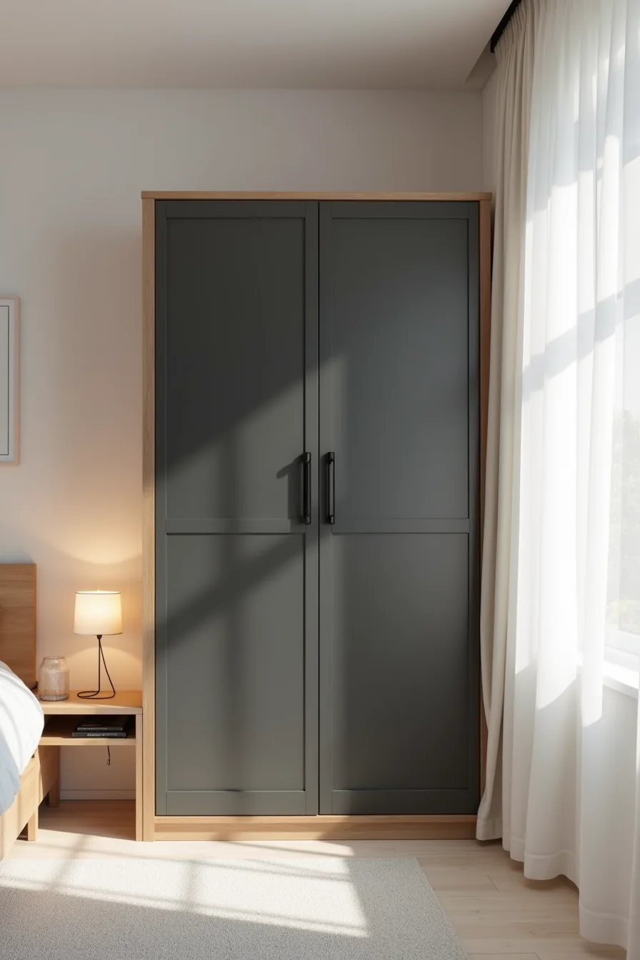
A light oak wardrobe body paired with deep charcoal-black door fronts creates a crisp visual anchor without the heaviness of a fully dark piece. The contrast draws the eye to the wardrobe as the room’s focal point, while the pale body keeps it from dominating the space. Matte black hardware reinforces the definition, glossy metal would compete with the dark doors instead of supporting them.
This pairing works best in rooms with soft white or warm neutral walls, where the dark doors stand out without clashing. It suits medium-sized bedrooms that need a grounding element; in a small room, limit the charcoal to the doors only and keep the body light to avoid shrinking the perceived space. For a large room, you can extend the contrast by choosing a deeper wall tone behind the wardrobe.
Costs run comparable to standard two-tone finishes, roughly 10-15% more than a single colour. Expect to clean charcoal fronts weekly with a microfibre cloth, dark surfaces show dust and fingerprints noticeably. The light oak body needs minimal upkeep, just occasional dusting and an annual wood conditioner.
Wardrobe Colour Combinations for Brighter Small Bedrooms
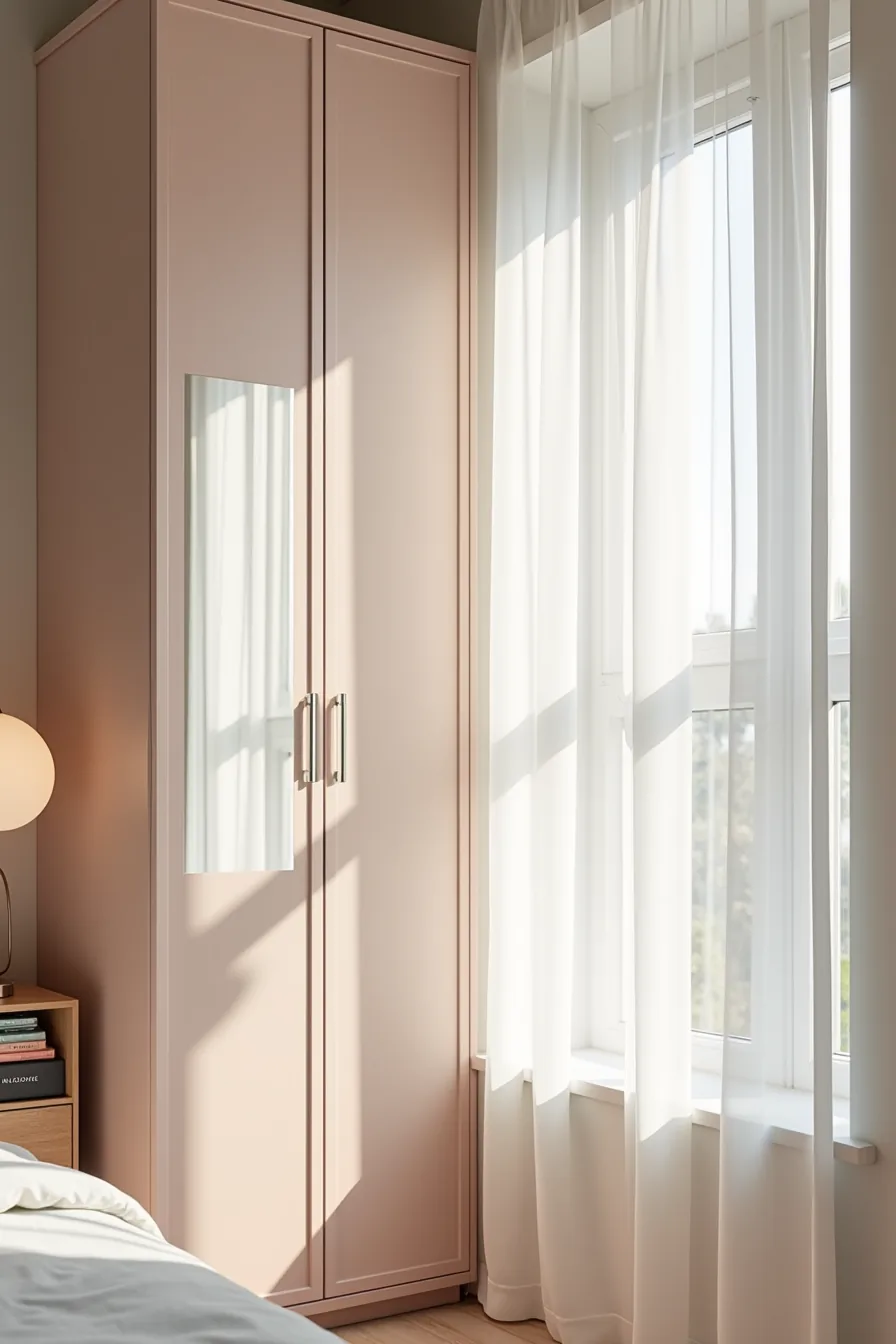
A narrow wardrobe with pale blush-pink painted doors set into a white frame reads as wall panelling rather than a bulky furnishing, which is exactly the effect you want in a compact room. The white frame visually expands the footprint by breaking up the colour mass, while the pink adds warmth without absorbing light the way darker hues do. A mirrored panel on one door doubles as a full-length dressing mirror and reflects daylight across the room, this single swap can make a 8×10-foot space feel noticeably larger than a fully opaque front would.
Slim chrome handles keep the hardware profile minimal, preventing visual clutter at eye level. This combination suits small bedrooms with north-facing light or rooms that rely on artificial lighting, where pale finishes prevent the space from feeling cave-like. Reproduce it by painting the wardrobe body white and using a low-sheen blush paint on the doors; budget roughly £150-£250 for paint and hardware if you diy it.
Clean the mirrored panel weekly with a glass spray and microfibre cloth to avoid smudges that dim its light-reflecting effect.
Jewel Tones with Metallic Accents for Impact
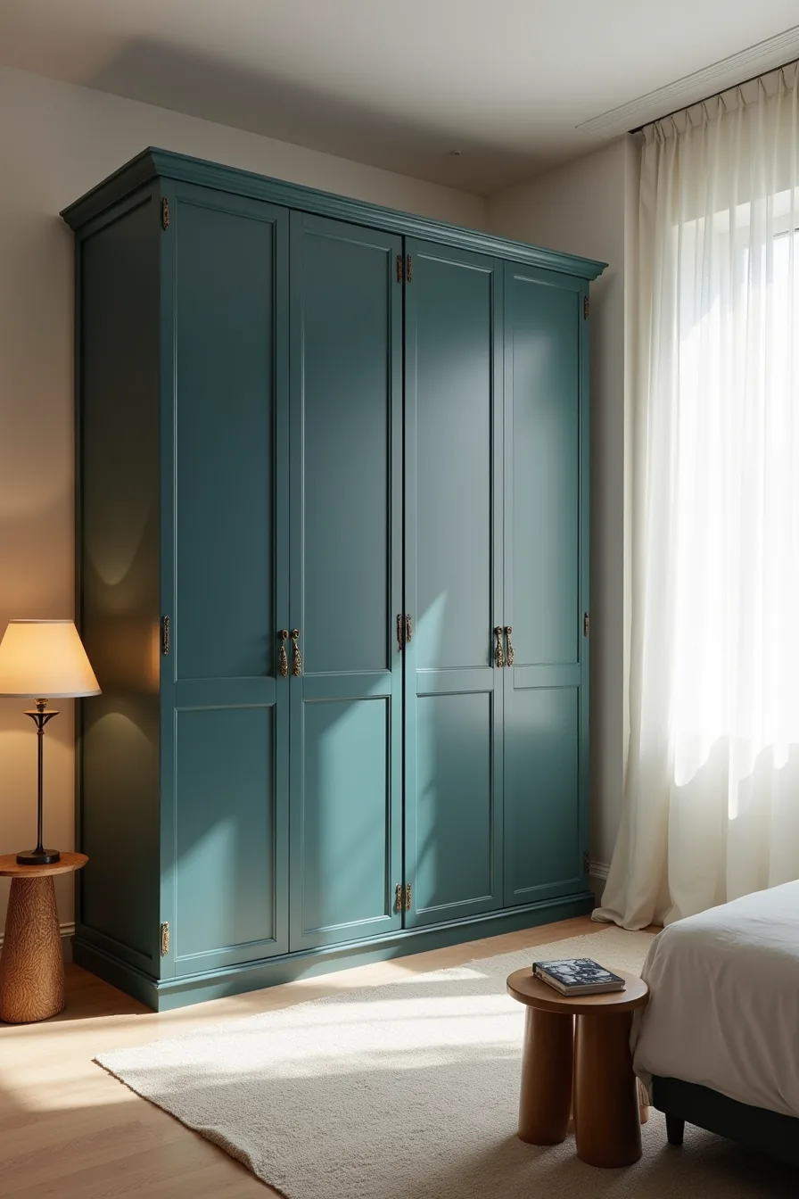
A deep teal-blue wardrobe with polished brass handles and corner brackets turns storage into the room’s anchor. The dark wood frame grounds the piece, while the metallic accents catch the eye and create points of light against the saturated paint. This combination works best in bedrooms of 12 feet or more across, where a high-contrast focal point won’t overwhelm the surrounding space.
The jewel tone demands commitment: dark surfaces show dust and fingerprints within days, so budget for a monthly wipe-down with a damp microfibre cloth. Brass hardware will tarnish over 1-2 years depending on humidity, choose a lacquered finish to extend that timeline. Pair the wardrobe with lighter wall colours like warm white or pale greige so the teal stays the hero rather than competing with other dark surfaces.
The wooden stool in front adds a natural texture that softens the formality of the metallic details, and it doubles as a step for reaching top shelves in this taller-than-average unit.
Renter-Friendly and Budget Routes to Colour
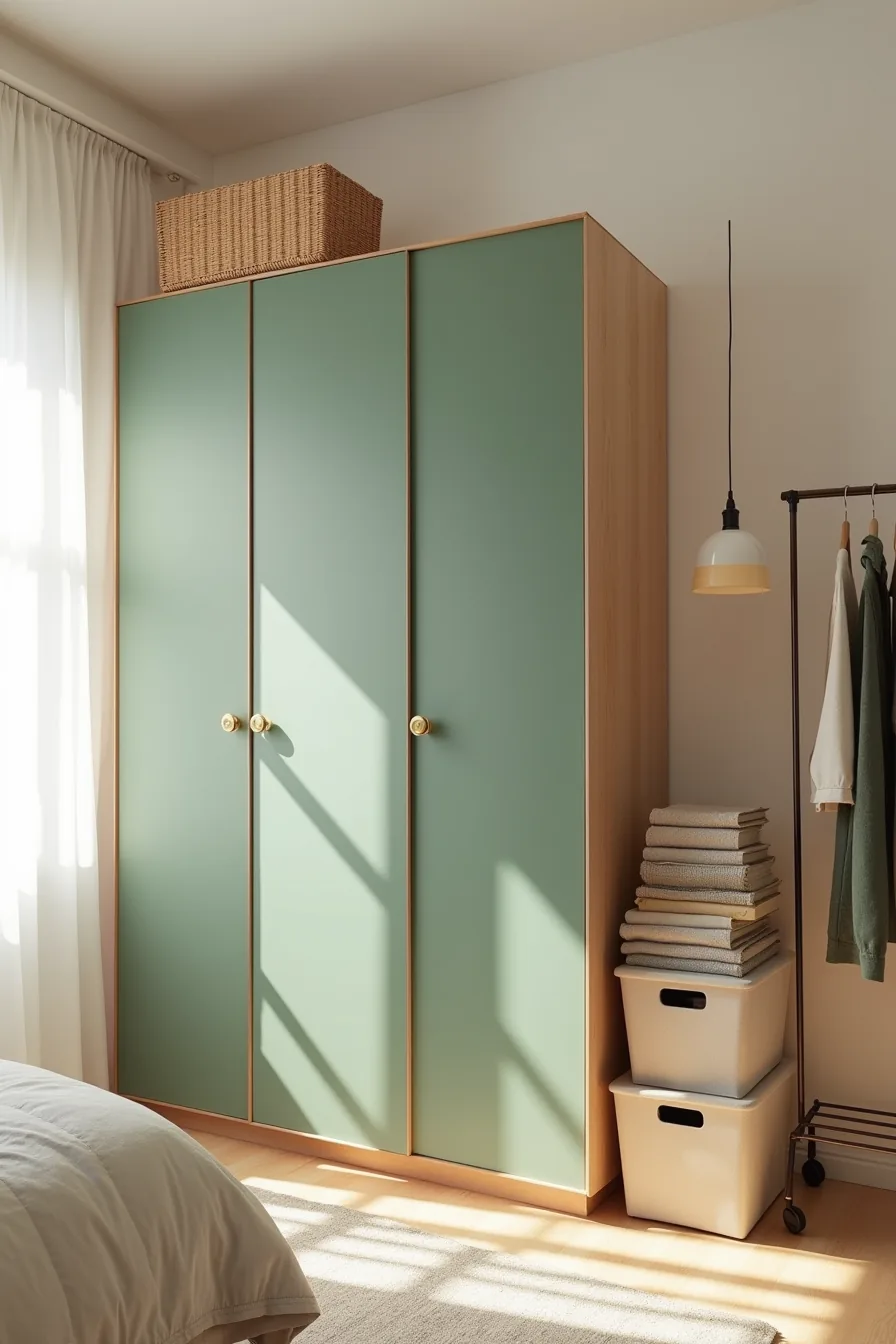
Peel-and-stick film delivers the visual impact of a painted wardrobe without the deposit risk. A forest-green matte film on standard hollow-core doors transforms a builder-basic rental piece into a design statement for roughly $30–$60 per door, depending on width. The key is surface prep: wipe doors with isopropyl alcohol, let dry completely, and use a squeegee to press out air bubbles, rushing this step causes peeling within weeks.
Replace the original knobs with brass pulls to improve the look further. Standard rental hardware uses a 2.5-inch or 3-inch hole spacing, so measure before buying; most replacement options cost $5–$15 per knob and install in under five minutes with a screwdriver. The fabric storage boxes and portable garment rack beside the wardrobe serve a dual purpose: they add colour through texture while providing overflow storage that keeps the wardrobe itself less crowded, which reduces wear on the film’s edges.
When you move out, the film peels off cleanly, just warm it with a hairdryer and pull at a 45-degree angle.
Where to start
You already know your space, your budget, and your tolerance for maintenance. That narrows the field more than any trend does. If you rent, stick with peel-and-stick laminate or a freestanding painted unit you can sell later.
If you own and want longevity, invest in lacquered or veneered panels, the higher upfront cost pays off in scratch resistance and resale value.
Pick one combination from this list and test it with a large color swatch on the wall beside your bed for 48 hours. Natural light changes everything. Then order a single door sample in your chosen finish before committing to the full wardrobe.
That one sample will tell you more than any digital rendering.
Frequently Asked Questions
What colour combination works best for a small bedroom wardrobe?
Light-on-light combinations, white with pale oak, soft grey, or warm beige, visually recede and prevent the wardrobe from dominating the space. Use the same colour as walls for smooth integration, or a matte white front to maximise reflected light.
Can I change my wardrobe colour without replacing the doors?
Yes. Use high-adhesion primer followed by two coats of satin or chalk paint for a lasting finish. Alternatively, apply removable vinyl film or replace only door panels if your wardrobe has a frame system, both routes avoid full replacement costs.
How do I choose between tone-on-tone and contrasting wardrobe colours?
Choose tone-on-tone (one hue in varying shades) if your room is under 10 square metres or has low ceilings, it feels calming and visually expands. Contrasting combinations work best in medium-to-large rooms where the wardrobe should anchor the design. Match the contrast strength to your floor and wall tones.
What hardware finishes work with different wardrobe colour combinations?
Brushed nickel or matte black suit white, grey, and blue-wood combos. Brass or gold pairs well with deep greens, navy, and warm beige. For high-gloss lacquers, pick integrated handles; for wood finishes, choose handles that echo the frame’s metallic tone.
Keep hardware consistent across all doors.