Choosing kitchen cabinet colors is the single highest-impact decision you can make in a remodel, but the right shade depends less on trends and more on your room’s light, size, and how long you plan to stay. A matte navy in a south-facing galley performs differently than the same hue in a north-facing open plan, and a $300 laminate refresh carries different risk than a $15,000 custom paint job. To avoid a costly mismatch, you need to match the color family to your layout, your lifestyle, and your exit strategy, six proven routes follow, each with the exact maintenance and budget trade-offs.
Key takeaways
- Warm neutrals work best in small kitchens because light beige, greige, and soft taupe reflect available light and hide everyday smudges better than stark white.
- Deep jewel tones like emerald and sapphire suit large, well-lit kitchens, but require matte or satin finishes to avoid showing fingerprints and water spots.
- Pair dark cabinets with light countertops in a 60-30-10 ratio to maintain balance, and test samples against your exact countertop before committing.
- Renters can use peel-and-stick vinyl film on cabinet fronts for under $100 per standard 10-door kitchen, but expect it to last only 2-3 years before edges lift.
Warm Neutrals: The Flexible Foundation
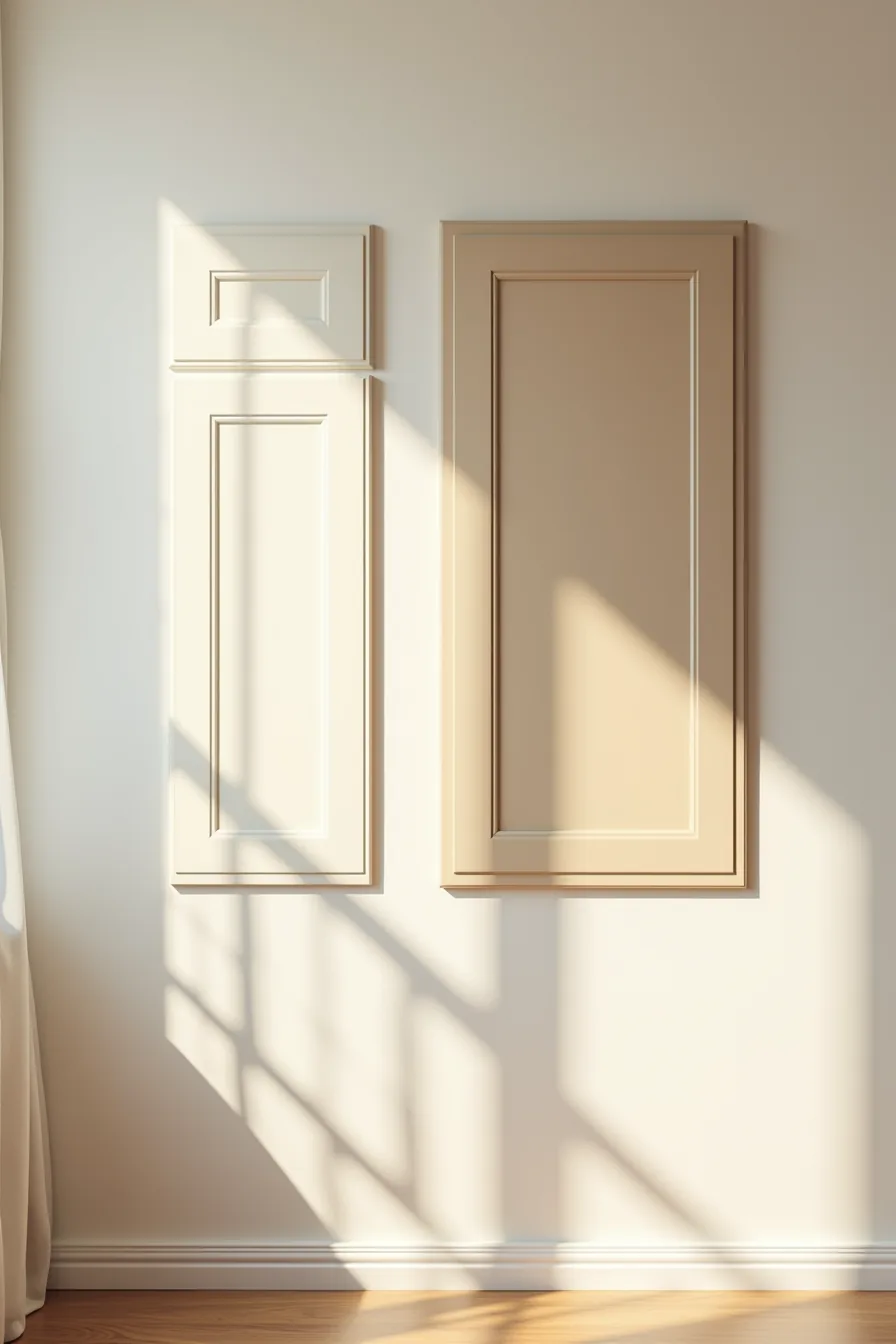
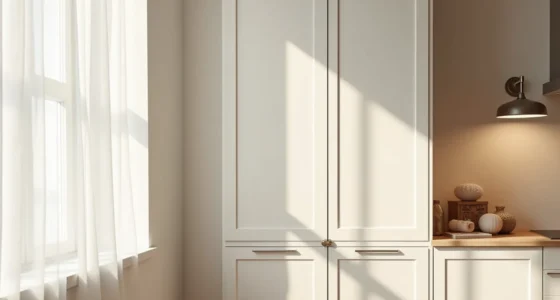
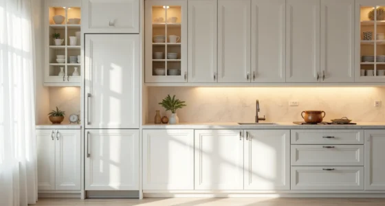
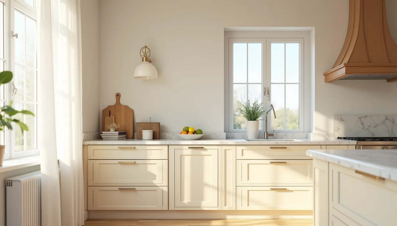
Cream, greige, and warm taupe form the backbone of low-risk kitchen cabinet colors because they read as white in bright light and as soft beige under dimmer fixtures. When you line up three cabinet door samples on a wall, cream on the left, greige in the center, warm taupe on the right, the undertone shift becomes obvious: cream carries yellow, greige holds green-gray, and taupe leans brown-pink. This side-by-side comparison matters because natural window light exposes undertones that storefront swatches hide.
Choose cream if your countertops have warm veining in gold or beige; it brightens north-facing kitchens that never see direct sun. Greige suits open-plan rooms where cabinet colors must harmonize with cool gray flooring and stainless appliances. Warm taupe pairs best with butcher block or walnut counters, but it demands more frequent cleaning, fingerprints show faster on mid-tone brown than on cream.
Maintenance is straightforward: all three finishes require a semi-gloss or satin paint for wipeability, and you’ll re-coat high-touch areas around the handle every 3–5 years. Undertone testing is non-negotiable, paint a 12-inch square on the wall and check it at breakfast, noon, and dusk before committing.
Deep Jewel Tones: Drama Without Trend Risk
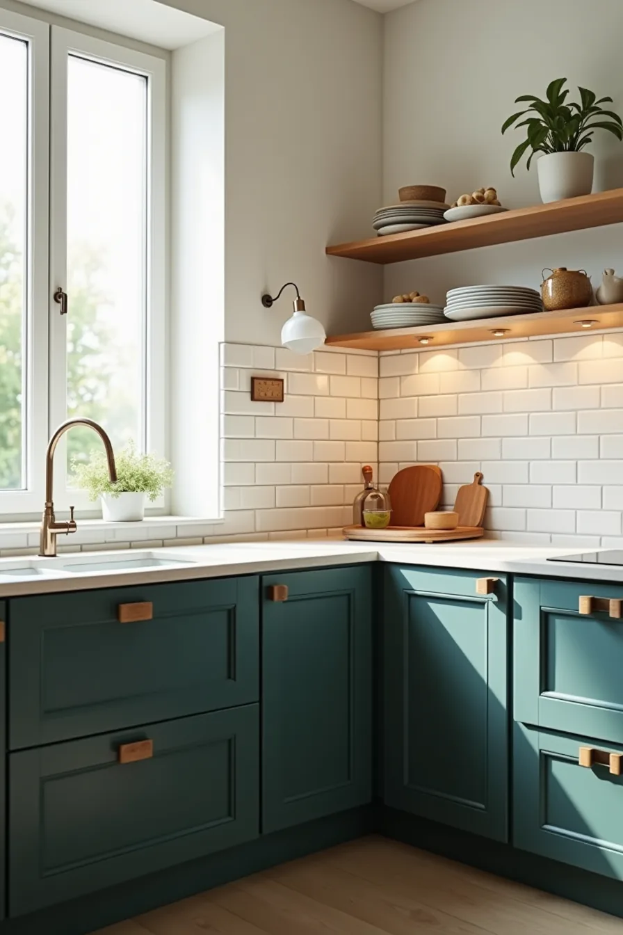
Navy, forest green, and charcoal make a confident statement because they carry the same timeless weight as a tailored navy suit, they read as classic rather than trendy. In a kitchen with strong natural light, a navy lower cabinet and forest green upper cabinet combo creates a grounded base that doesn’t darken the room the way matte black or deep purple would. The white subway tile backsplash between them acts as a reflector, bouncing window light back onto the painted surfaces and keeping the color depth from swallowing the space.
This pairing suits medium-to-large kitchens with at least one south- or west-facing window; in compact or north-facing rooms, the dark tones can make walls feel like they’re closing in. You’ll want to paint the lower cabinets in a satin or semi-gloss finish to withstand daily wear, while the uppers can stay in a lower-sheen eggshell since they see less contact. Budget-wise, this is a weekend DIY if you’re handy, two quarts of quality cabinet paint (roughly $30–$50 per quart) plus primer will cover most standard lowers and uppers.
For a renter-friendly version, skip the paint and use peel-and-stick cabinet wraps in deep green for the lowers, which you can remove without damaging the original finish. The payoff: jewel tones hide crumbs and smudges better than mid-tone grays, but they show water spots and dust more visibly, so plan on wiping down fronts every week or two. To keep the look timeless, avoid pairing these with gold hardware, matte black or brushed nickel keeps the palette grounded and adaptable to future decor shifts.
Muted vs. Saturated: Choosing Your Color Intensity
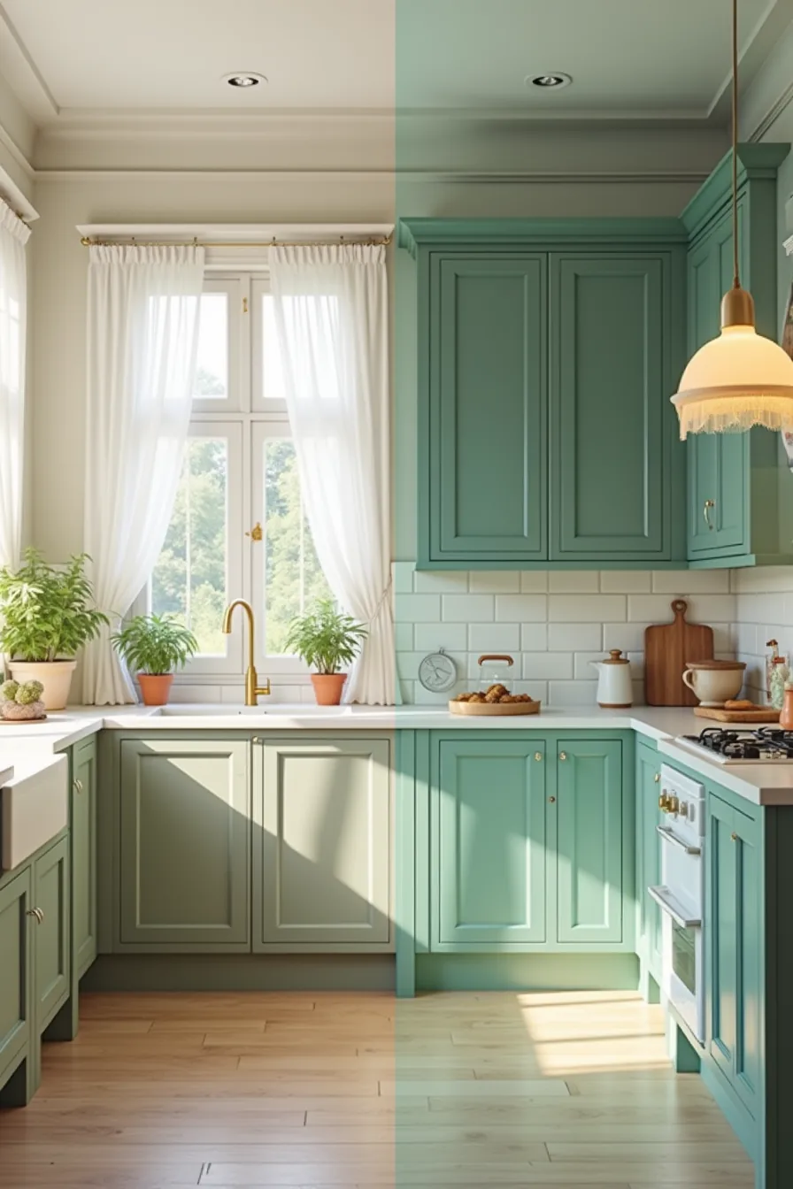
The difference between a muted sage and a saturated emerald isn’t just taste, it’s physics. Under the same daylight, the soft finish of muted sage absorbs and scatters light gently, making a small kitchen feel airier and less visually demanding. The glossy, saturated emerald behaves oppositely: it reflects sharp, high-contrast highlights that add depth but also emphasize every fingerprint and water smear.
In a compact space, stick with muted tones for lower cabinets; they recede, whereas high-chroma colors visually advance and shrink the room.
For large kitchens, saturated hues with a glossy finish perform best on an accent island or pantry wall, where their reflective qualities add life without overwhelming. Muted colors hide surface dust better but show grease as a subtle sheen change; saturated gloss reveals smudges within days. If you crave intensity but lack square footage, saturate the uppers only, eye-level color reads as intentional, not oppressive, and leaves the lower half calm.
Cabinet and Countertop Pairing: Contrast and Harmony
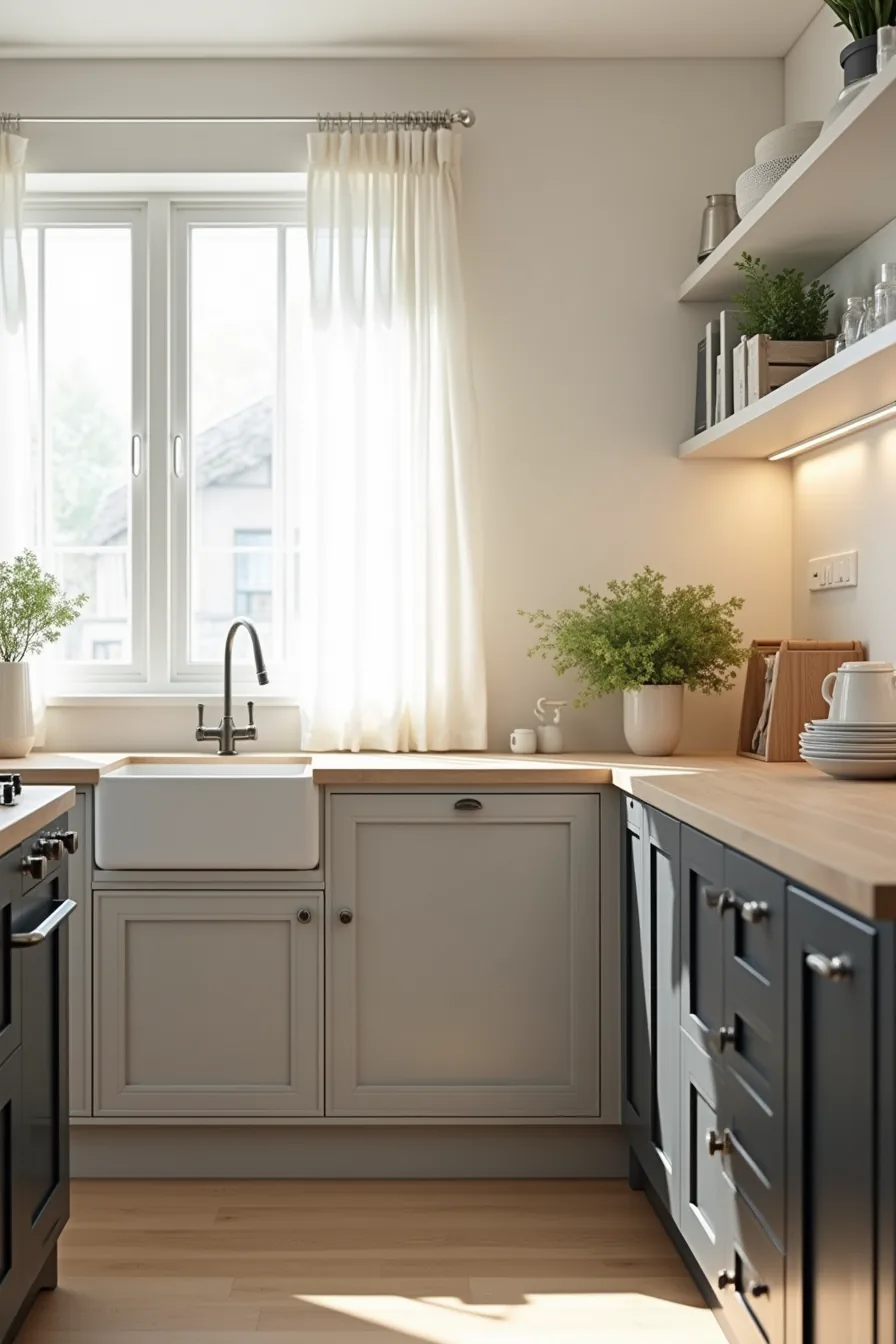
The most reliable cabinet and countertop pairing strategy is to anchor one surface in a light tone and the other in a dark one. Light gray cabinets with dark charcoal quartz create a crisp boundary that defines the workspace visually, giving a galley or L-shaped kitchen a sense of structure without requiring additional trim or hardware detail. The charcoal quartz hides coffee rings and flour dust well, but it will show hard-water spots, so a daily wipe-down with a squeegee is the realistic maintenance baseline.
Flipping the scheme, dark charcoal cabinets with a light oak butcher-block counter, reverses the visual weight. The oak brings warmth and softens the formality of the dark cabinetry, making it a good fit for kitchens with limited natural light where a fully dark counter would swallow the room. Butcher block requires monthly oiling and stands up poorly to standing water, so keep it away from the sink zone or accept that the section nearest the faucet will darken unevenly within a year.
For a medium-size open-plan kitchen, this pairing works best on a peninsula or island, letting the contrast read from the living area.
Budget, Rental, and Investment Routes
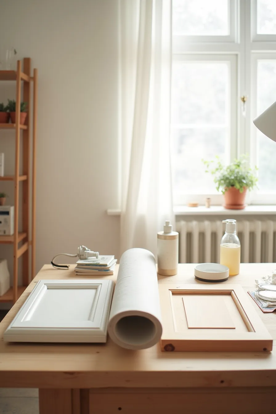
Your budget and timeline determine which of three cabinet color strategies fits. The most economical route starts at roughly $60–$100 in supplies: primer, paint, rollers, and painter’s tape. You’ll spend a weekend sanding, priming, and applying two coats, and the finish lasts three to five years before chipping appears on high-touch edges.
Use a bonding primer designed for laminate or wood, and accept that glossy cabinet paint magnifies surface imperfections.
Renters should ask for written landlord approval before applying peel-and-stick cabinet film. A standard roll covers about 20–25 square feet and costs $30–$50, making a full cabinet refresh possible for under $200. The film removes cleanly within the first year, but heat from a dishwasher or oven can cause edges to lift, so avoid wrapping doors near appliance vents.
Choose matte film over gloss, it hides fingerprints and shows fewer roller marks during installation.
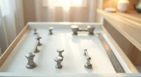
The long-term investment route means replacing doors and drawer fronts rather than refacing the entire cabinet box. Solid wood doors with visible dovetail joinery, like the sample on the workshop table, run $150–$400 per door installed. This approach gives you factory-grade paint or stain that resists yellowing and chipping for 15–20 years, making it the right choice if you plan to stay in the home for a decade or more.
Adapting Kitchen Cabinet Colors to Your Space
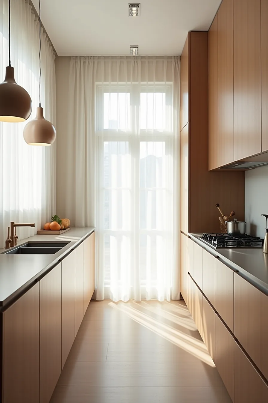
A small galley with a 9-foot run calls for pale greige cabinets, the light reflectance keeps the walls from visually closing in, and the neutral tone prevents the narrow corridor from feeling like a tunnel. You can safely use the same color on upper and lower cabinets here because the limited surface area means contrast would fragment the sightline.
Medium kitchens, around 12 feet of cabinetry, handle warm taupe without shrinking the room. The deeper value adds anchor and grounds a central island or dining nook, but keep it on base cabinets only; pairing it with a lighter upper color preserves openness at eye level. In a 16-foot large galley, deep charcoal prevents the long run from feeling monotonous and empty.
The darker mass absorbs light, so verify your overhead fixtures deliver at least 3,000 lumens per 10-foot section, anything less turns the charcoal muddy, especially on north-facing walls where daylight never fully compensates.
Your decision checklist
Before you commit, run your top two choices through this filter:
- Traffic flow: Will the finish hold up against daily use in your household?
- Light reality: Does the color work with your actual natural light, not a showroom’s?
- Payoff timeline: Are you okay with the maintenance-to-impact ratio?
Your next step is simple: order three 8-by-10-inch sample boards in your shortlisted colors, tape them to your cabinet doors, and live with them for a full week. Observe them at breakfast, noon, and under evening lights. Your gut will settle it faster than any mood board.
Frequently Asked Questions
What kitchen cabinet colors look good under artificial light versus natural daylight?
Under warm LED or halogen light, choose greige, warm white, or soft sage, they stay flattering. In bright natural daylight, opt for navy, charcoal, or crisp white, which read clearly without yellowing.
Can I paint kitchen cabinets myself, or do I need a professional finish?
You can paint them yourself if you’ve 3–5 days, a sprayer or high-quality brush, and patience for sanding and priming. A professional finish lasts longer and avoids brush marks, but costs $2,000–$5,000.
Which cabinet and countertop color combinations hide stains and fingerprints best?
Matte medium-gray cabinets with a speckled quartz countertop hide smudges and water spots effectively. Avoid glossy white or deep black, both show every fingerprint and oil streak. Textured laminate counters also mask daily wear.
Do muted cabinet colors cost more than saturated ones, or is the price the same?
The price is the same for paint or factory finishes, muted tones like sage or greige don’t cost extra. However, custom color matching or premium low-VOC paints add $50–$150 per gallon, regardless of saturation level.