An open plan kitchen isn’t a single layout but a design strategy that merges cooking, dining, and living zones into one continuous volume, and the way you draw those boundaries determines whether the space feels chaotic or cohesive. The distinction comes down to deliberate choices in sightlines, surface transitions, and storage placement, not just knocking down a wall. Below, six distinct interpretations show you how to balance function and flow, from renter-friendly islands to long-term structural merges.
Key takeaways
Island boundaries anchor the cooking zone while preserving sightlines; place the island 36–48 inches from counters to keep traffic flowing. Pendant light clusters define the dining or prep area without walls; hang them 28–36 inches above the countertop for both task light and visual separation. Cabinet color shifts at the boundary, like switching from base to upper units, create a subtle transition that works in rentals where structural changes aren’t allowed. Low-profile counters (24–30 inches high) double as snack bars or prep ledges, but they require a dedicated floor plan and won’t suit households needing full-height seating.
Island Boundary: Define Space Without Walls
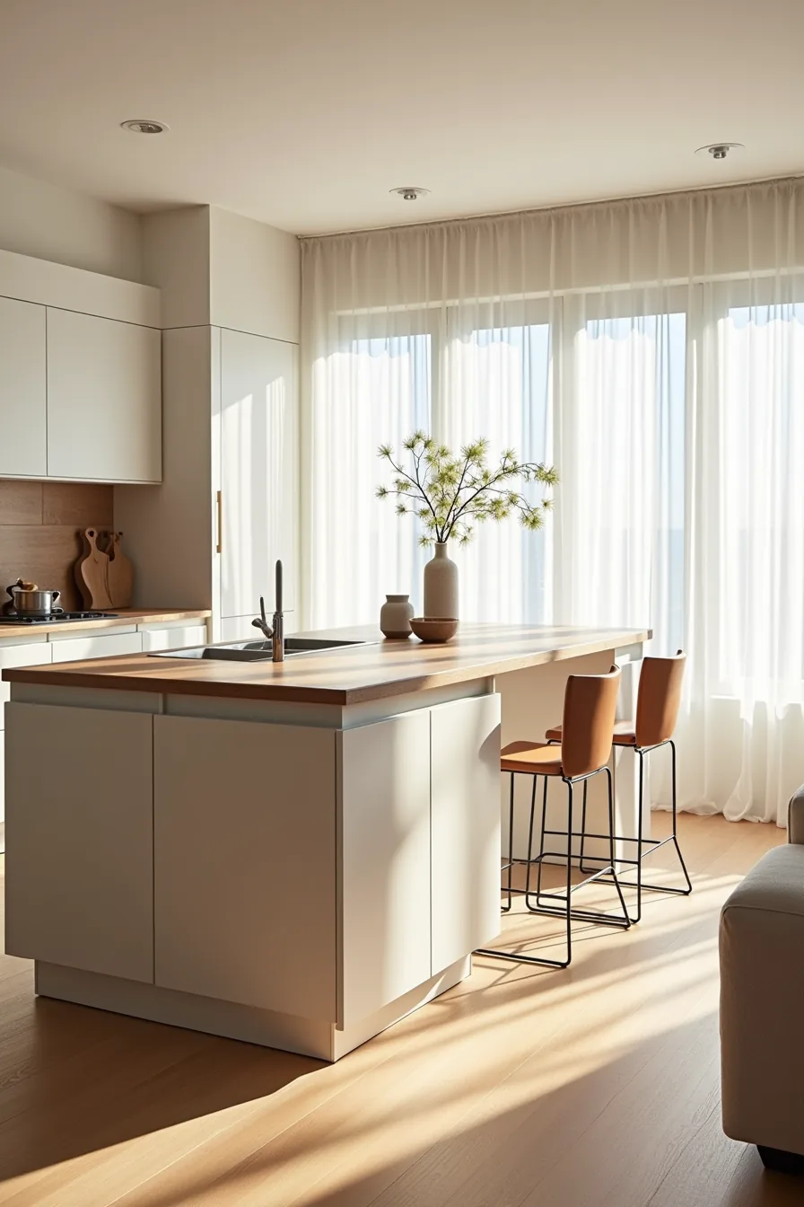
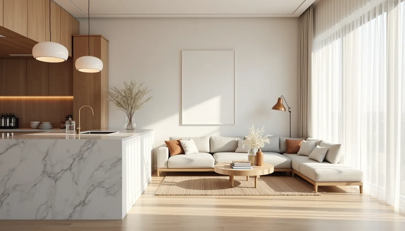
The most effective way to carve out an open plan kitchen without a single wall is a generously sized island set perpendicular to your main counter run. This orientation creates a natural T-junction, visually separating the cooking zone from the living area while keeping sightlines clear. In the setup pictured, the island’s dark base cabinetry contrasts sharply with the lighter kitchen run behind it, anchoring the piece as a deliberate architectural feature rather than an afterthought.
Size matters more than style here. For a medium room (roughly 15–25 square meters), you want an island 180–240 cm long with at least 100 cm of clearance on the cooking side and 90 cm on the seating side. The thick stone top, aim for 3–4 cm, adds visual weight that reinforces the boundary.
Pulling dining chairs up to the living-room side turns the island into a casual breakfast bar, but remember: overhangs beyond 30 cm require knee-space clearance of at least 65 cm in height to keep seated guests comfortable. This setup suits households that cook daily and entertain casually, but skip it if your kitchen runs narrower than 3 meters, the clearance math simply won’t work.
Pendant Light Zoning: Create Layers Above
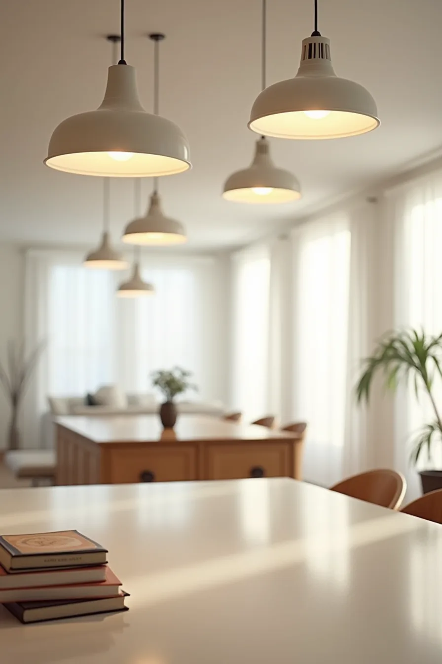
Pendant light zoning gives you the partition an island provides, but without occupying a single centimeter of floor space. The three fixtures suspended in a line above the counter establish a horizontal visual plane that reads as the kitchen’s ceiling, even though the actual ceiling continues uninterrupted into the living zone. This trick works because the human eye treats a row of repeated objects as a boundary, the pendants become an invisible wall at eye level.
Hang them 70–90 cm above the counter surface for task lighting, and space them 60–90 cm apart so the line reads as intentional rather than scattered. Matte black or brass shades work best against white ceilings because they hold visual weight without glare. For a budget route, three identical corded pendants from a hardware store will cost less than a single designer fixture, and you can install them yourself if you’ve a junction box above.
Renter-friendly? Choose plug-in pendant kits with swag hooks, no hardwiring required, and you can patch the ceiling holes before moving out. This approach suits rooms where the kitchen flows into a dining area but you want guests to instinctively stop at the counter rather than wandering into the prep zone mid-conversation.
Cabinet Color Transition: Shift Tone at the Boundary
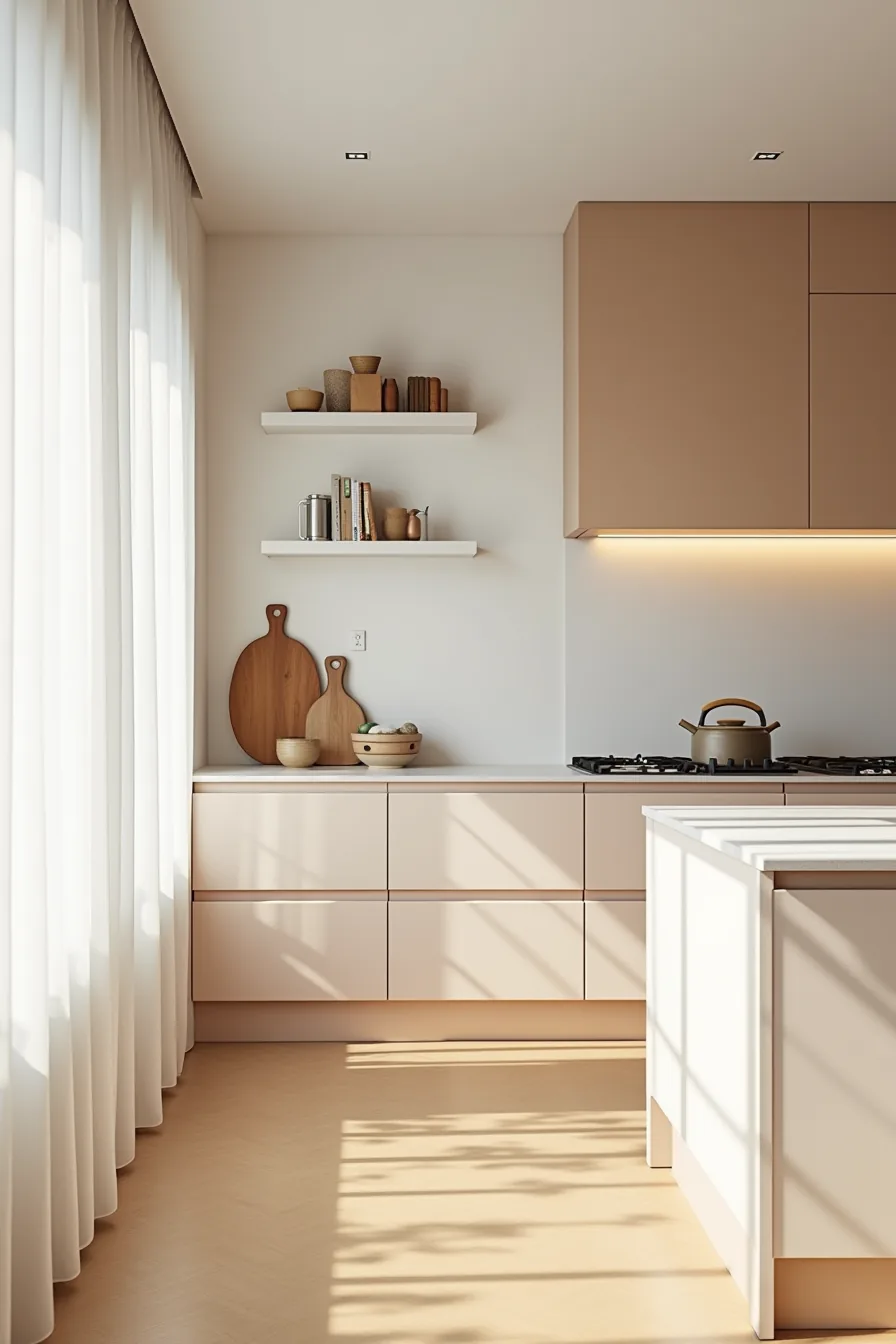
A cabinet color transition marks the kitchen’s edge without a single wall, using paint or finish to tell the eye where cooking ends and lounging begins. The straight-on view of your kitchen run shows lower cabinets in a deep slate blue stopping at the island, where the base shifts to a warm oak, the countertop carries the same stone across both, so the change reads as intentional layering, not a mistake. Upper cabinetry above the prep zone stays in the lighter tone, anchoring the kitchen side, while the living area’s furniture picks up the wood warmth for a smooth handoff.
This works best when the two hues share undertone, pair charcoal with walnut, or sage with ash, rather than clashing cools and warms. Limit the transition to one run of lower cabinets and the island face; painting every surface creates chaos, not a boundary. For a budget route, repaint existing lower cabinet doors in a contrasting shade (about 2–3 days of labor, including sanding and primer), while a renter-friendly option uses peel-and-stick vinyl film on the island only, removable without residue.
Expect to touch up painted edges near the dishwasher annually, as steam and heat weaken the seal. This suits medium and large open plans where a full wall is overkill, but a single color run leaves the kitchen feeling lost in the room.
Low-Profile Counters: Keep Sightlines Open
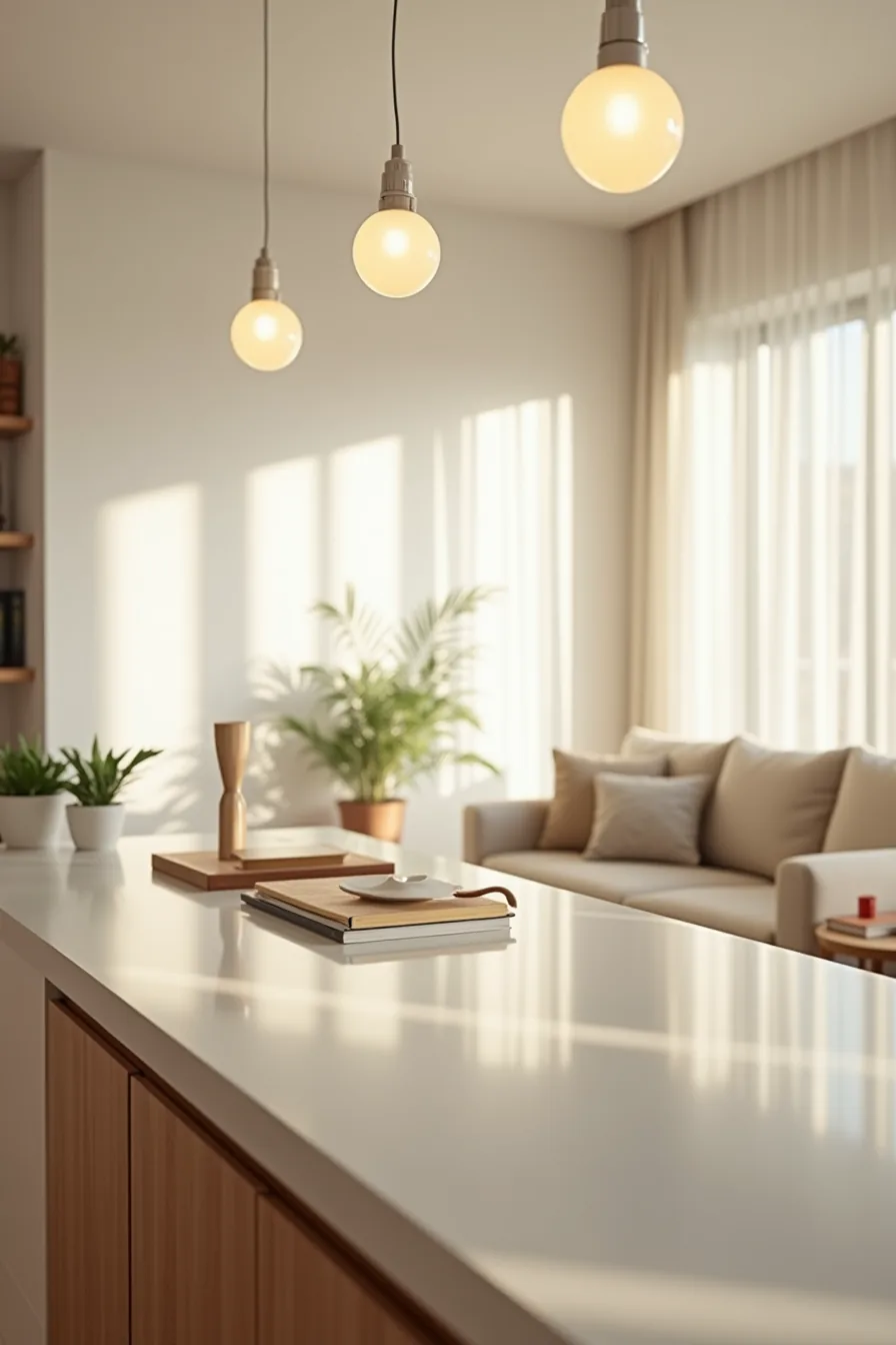
A low-profile counter trades standard 36-inch height for a 30–32-inch bar or console profile, dropping the visual mass so your eye travels straight over the top to the sofa and window beyond. The shallow edge, typically 12–15 inches deep instead of the usual 24–25, reads as a shelf, not a barrier, which keeps the kitchen visually attached to the living room even in a narrow footprint.
This setup suits small to medium open plans where a full-depth island would block the path between zones. Use a solid-surface or quartz top at this depth; thin profiles expose edges to chipping, and wood veneer will cup without proper sealing. A renter-friendly route places a freestanding console table at the same height, anchored with a butcher-block top you can move out in an afternoon.
Clearance matters: leave at least 36 inches between the counter face and the nearest sofa arm so the walkway stays functional. Expect to dust the exposed top weekly, low profiles collect clutter fast because they invite perching, not just prep.
Ventilation and Odor Control: Hide the Cooking Zone
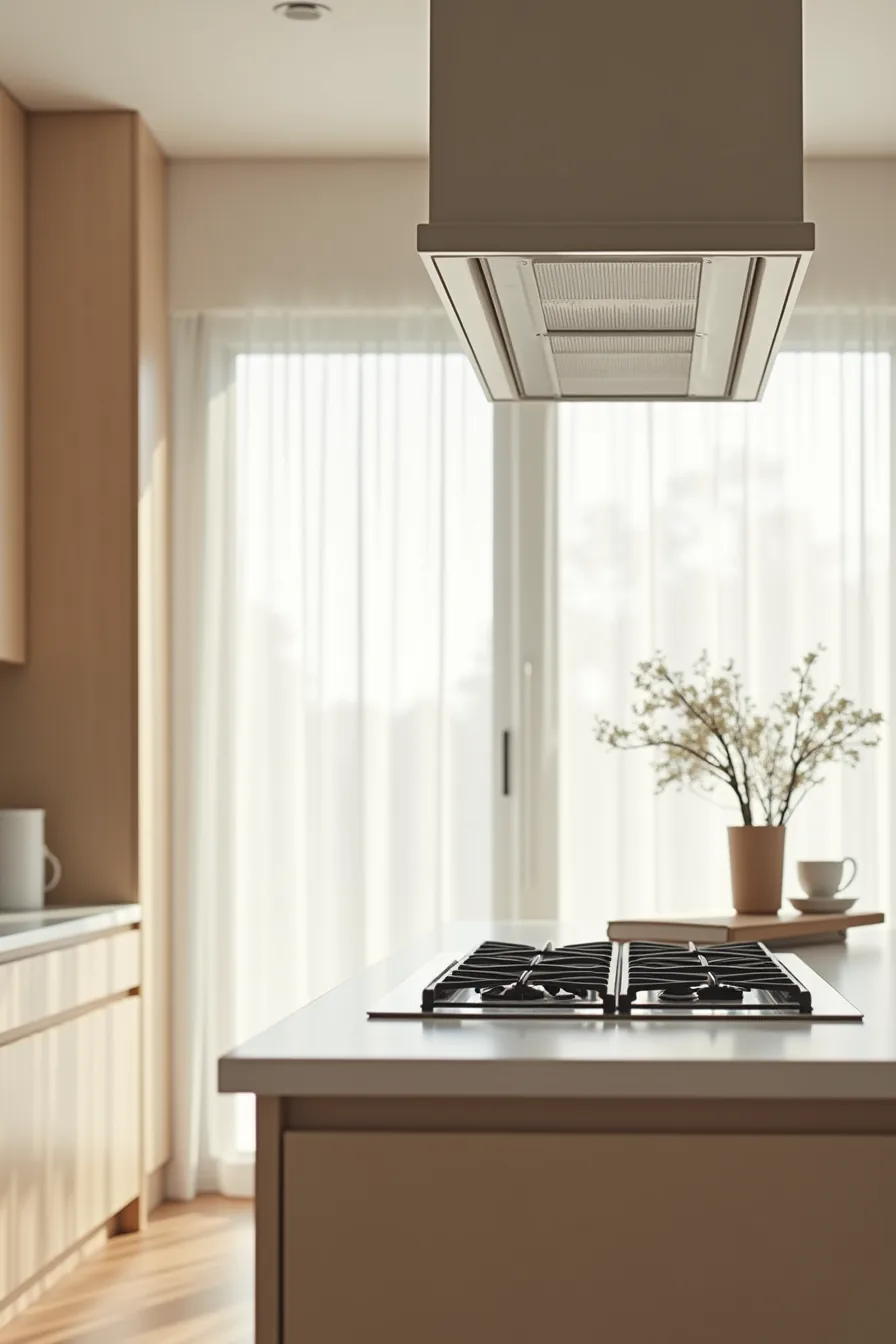
When your kitchen shares air with the living area, the cooking zone becomes a scent broadcaster. A downraft hood rising from the island cooktop solves this without adding an overhead beam or canopy that would break the sightline. These systems pull air horizontally across the cooking surface before it reaches face height, which keeps smoke and grease from drifting toward the sofa.
The trade-off is performance. Downraft units typically move 400–600 CFM compared to 900+ CFM for a well-placed overhead canopy, so they suit lighter cooking, sautéing, simmering, quick sears, rather than frequent deep-frying or wok work. They run noticeably louder at high settings, often 6–8 sones, so budget for a model with a variable-speed blower and run it a few minutes after you finish cooking to clear residual odors.
Installation requires ductwork routed beneath the slab, which means planning during a renovation, retrofitting one into an existing island is rarely cost-effective. A ductless alternative with charcoal filters recirculates air but leaves more cooking smell behind; change the filters every 3–4 months or the unit just moves grease around the room. For renters, a portable induction cooktop with a built-in downdraft vent on the countertop gives you a cooking zone that vents from the surface without permanent installation, you trade BTU output for flexibility, but it keeps the space visually clean.
Material Continuity: Unify the Whole Space
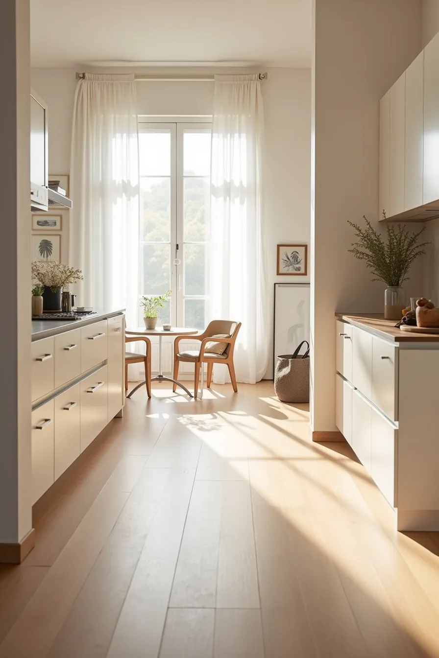
The fastest way to make an open plan feel intentional is to run a single flooring material from the kitchen into the living zone with no transition strip at the boundary. Wide-plank engineered oak or large-format porcelain tile, laid continuously, does the visual work of stitching both rooms together, the eye reads one surface, so the space registers as a whole rather than two rooms that happen to lack a wall. Large-format tile, typically 24×24 inches or larger, minimizes grout lines in the kitchen zone where spills happen, and it carries a PEI wear rating of IV or V for heavy residential traffic; engineered wood suits the living area’s softer feel but requires you to accept water risk near the sink unless you specify a waterproof core.
Matching the countertop material into a breakfast bar or a low ledge that faces the sofa blurs the boundary further. A quartz or porcelain slab extending from the run of cabinets into a cantilevered seating lip creates one unbroken surface that reads as sculpture rather than cabinetry. This approach suits open plan kitchens that feel less exposed because the uniformity gives the eye a resting place, your gaze travels along a single texture instead of bouncing between competing finishes.
Budget realistically: continuous large-format tile runs $8–$15 per square foot installed, engineered oak $7–$12, and extending a countertop slab into the living area adds 4–6 linear feet of material cost. Maintenance is the trade-off, every scuff on the living-room side of the floor is visible in the kitchen sightline, so choose a matte finish with a textured surface rating (R10 or R11 for tile) that hides daily wear and cleans with a damp mop rather than a glossy polish that shows every footprint.
Your Decision Checklist
Before you book a contractor or order a single cabinet, walk your actual space. Measure the clear floor area, note where natural light enters, and track how you move between cooking, eating, and living zones for one full day.
You need a layout that preserves at least 36 inches of walkway clearance, ventilation that reaches the cooking surface, and materials that match your real maintenance tolerance, not your aspirational one. If you rent, prioritize a movable island and plug-in appliances over structural changes. If you own and plan to stay five-plus years, invest in permanent ducting and full-height cabinetry.
Start with one change this week: sketch your current floor plan and mark every traffic path. That single drawing will reveal which open plan kitchen idea fits your home.
Frequently Asked Questions
What size island works best in a small open plan kitchen?
Stick to a compact island between 70–100 cm wide and 120–150 cm long. This leaves at least 90 cm of clearance on all sides for traffic and appliance doors to open safely.
Can you make an open plan kitchen feel less exposed without adding walls?
Yes. Use a tall freestanding shelving unit, a suspended ceiling-mounted screen, or a large indoor plant as a visual buffer. These create partial separation while preserving light flow and sightlines.
How do pendant lights help define an open plan kitchen layout?
Pendants act as a visual anchor over the island or work zone, marking the cooking area as distinct from the living space. Hang them 75–90 cm above the countertop for both task lighting and spatial definition.
What’s the most cost-effective way to separate a kitchen from a living room?
Install a lightweight sliding barn door or a folding room divider, both cost less than structural walls. Alternatively, a low bench or console table placed perpendicular to the counter creates a subtle boundary for under $200.