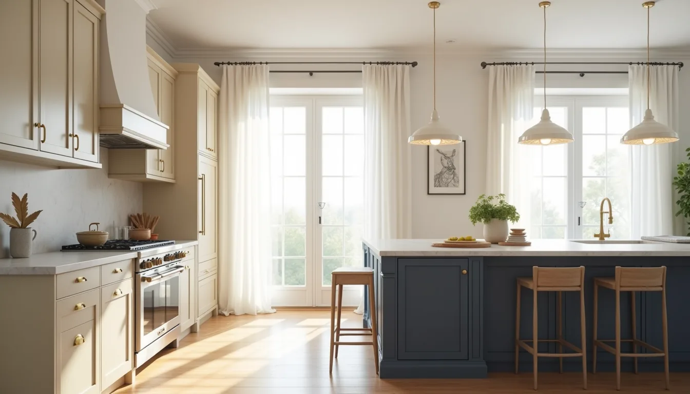
The right kitchen cabinet color ideas do more than set a mood, they determine how often you’ll scrub, how much light the room reflects, and whether the space feels larger or more intimate. A glossy deep green hides grease poorly but flatters brass hardware; a matte off-white opens a galley kitchen yet chips if you drag heavy pans across it. Your choice is a maintenance contract, not a paint swatch.
The six approaches below break down what each finish actually demands, who it suits, and where to spend versus save.
Key takeaways
- Dark cabinets demand ample natural or layered artificial light, so reserve them for kitchens with at least two light sources or open floor plans to avoid a cave-like effect.
- Two-tone schemes work best when you pair a dark lower cabinet with a light upper one, which anchors the room visually while keeping sightlines open at eye level.
- Warm neutrals like greige or soft taupe offer the highest resale flexibility, but require you to test undertones against your countertop since gray-beige can shift pink or green under different lighting.
- Renter-friendly routes stick to peel-and-stick film or removable contact paper on flat-front doors, which costs 10-30% of a paint job but won’t survive textured or raised-panel surfaces without visible bubbling.
Light vs Dark Cabinets: When to Choose Each
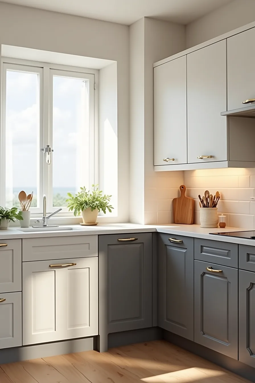
The split-corner setup, white cabinets with chrome handles beside charcoal cabinets with matte black pulls, demonstrates the core trade-off you face. Light cabinets (white, off-white, pale gray) bounce natural light around the room, making a narrow galley or windowless kitchen feel noticeably larger. They also reveal smudges, grease splatters, and water spots quickly, so expect to wipe fronts every few days if you cook daily.
Dark cabinets (charcoal, espresso, deep slate) hide daily messes far better, but they absorb light and can visually shrink a compact footprint. If your kitchen receives less than four hours of direct sunlight, charcoal risks feeling like a cave rather than a statement. Match the color to your actual usage: light suits renters or occasional cooks who prioritize an airy look and can tolerate upkeep; dark fits heavy home cooks with larger, brighter layouts who want low-maintenance surfaces.
The chrome-versus-matte hardware pairing also matters, chrome reflects light and suits cool white tones, while matte black anchors dark cabinets without competing for attention.
Two-Tone Kitchen Cabinets for Visual Interest
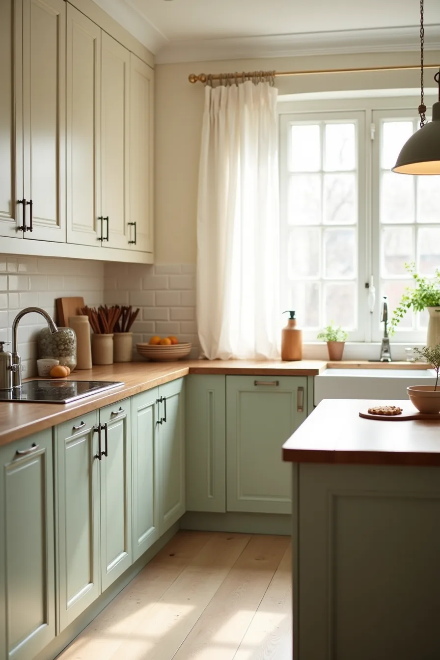
Two-tone kitchen cabinets work because the contrast gives the room a defined rhythm without demanding a single bold commitment. In this setup, the sage-green lower cabinets ground the space visually, while the cream upper cabinets keep the eye level light and airy. The warm gray island provides a third distinct tone that bridges the two and prevents the green-and-cream combination from feeling like a costume.
This pairing suits kitchens with abundant natural light and a window positioned mid-wall, where the color shift at the counter line feels like a deliberate design decision rather than an interruption. The butcher block countertop adds warmth that softens the cooler green and prevents the lower run from looking clinical業a practical choice if you frequently prep food, since the wood hides knife scratches that would mar a glossier surface.
You can replicate this look without custom cabinetry by painting only the base units and leaving upper cabinets as-is. It costs roughly half of a full reface, and the upper cabinets stay neutral if you later grow tired of the green. Just keep the two primary tones within the same undertone family (both warm or both cool), mixing a cool sage with a warm cream creates a muddy meeting point at the counter line, and you’ll notice it every time you stand at the sink.
Warm Neutral Palette: The Flexible Middle Ground
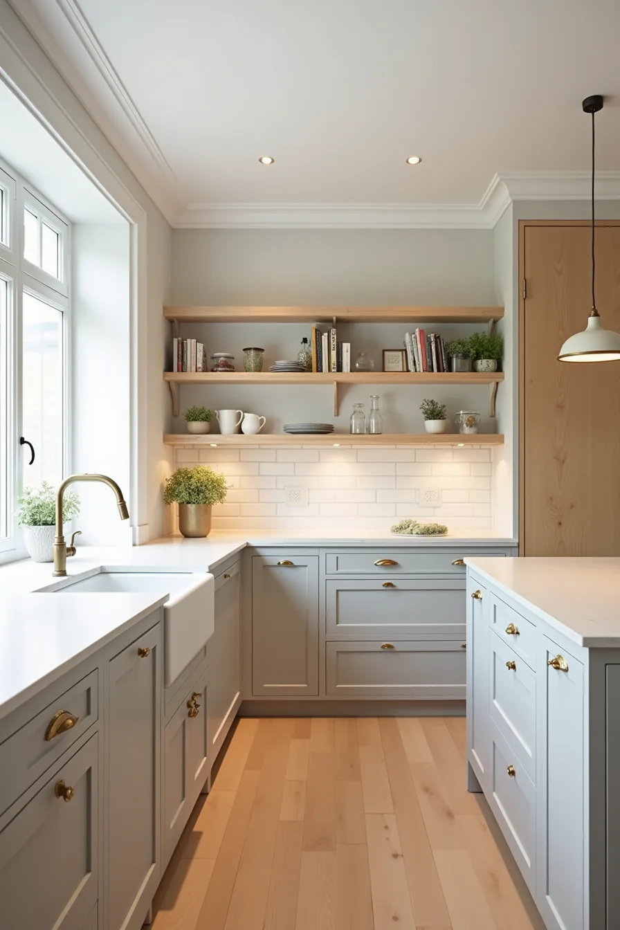
Greige cabinets, a blend of gray and beige, work because they absorb whatever light your kitchen gives them. In a full-perimeter run with a matching island, greige reads as sophisticated rather than sterile, especially when paired with warm white subway tile that adds texture without competing for attention. The brass pulls introduce a metallic accent that prevents the neutral field from flattening into a single tone.
This palette suits kitchens of any footprint, but it performs best in medium spaces where you want continuity without the visual weight of dark cabinetry. The light oak open shelving breaks up the cabinet run and gives you a spot to display ceramics or glassware, adding personality that a fully closed cabinet wall can’t. Greige requires a light hand with styling, leaning too hard into beige accessories makes the room look dated, so keep countertop items minimal and let the brass and tile carry the character.
Kitchen Cabinet Colors That Make Small Spaces Feel Bigger
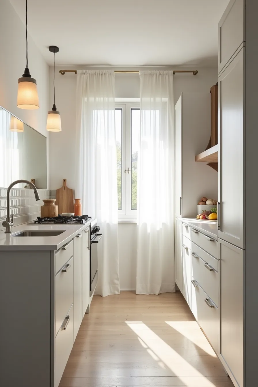
Pale gray cabinets are the strongest optical trick for a narrow galley because the low-contrast finish blurs the line between cabinetry and wall, so the room’s boundaries recede. Pair them with a white quartz countertop that reflects available light rather than absorbing it, and the visual ceiling rises accordingly. The stainless steel hardware adds a crisp line of definition without introducing a second color that could fragment the sightline.
Mirror backsplash tiles do the heavy lifting in compact footprints by doubling the perceived depth behind the counter. You get the reflection benefit without the maintenance cost of actual mirrors, and the grout lines add subtle texture that keeps the surface from feeling clinical. Keep countertop items to a single small appliance and one cutting board, every object you remove returns usable visual space.
This approach suits renters because pale gray is a standard landlord-approved neutral, and quartz plus mirror tile can be reversed to the original backsplash when you move out.
Bold and Saturated: Navy, Forest Green, and Deep Jewel Tones
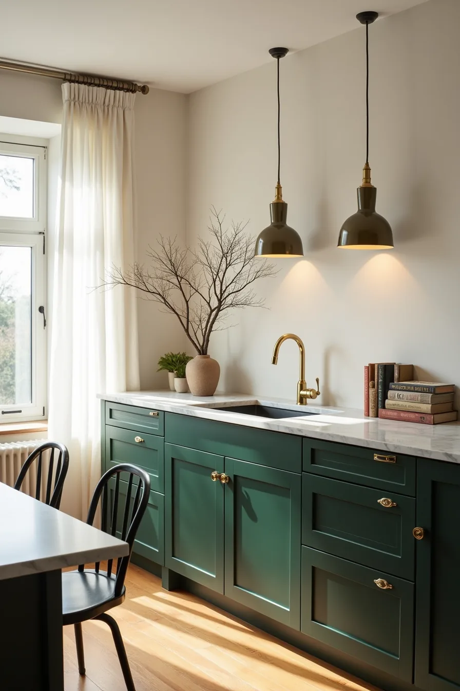
Deep jewel tones, forest green, navy, or plum, function as a long-term investment when you commit to full-height cabinetry and premium hardware. The forest-green cabinets in this setup anchor the room because the matte finish absorbs glare rather than reflecting it, which keeps the color rich without washing out under warm pendant lighting. Brass fixtures and pulls create a deliberate contrast point; the metallic warmth prevents the saturated green from reading as flat or somber.
A white marble countertop with gray veining supplies the necessary light reflectance, so the cabinet color stays grounded instead of swallowing the room. This pairing demands upkeep: marble requires sealing every 6–12 months and will etch with acidic spills, so budget for resealing or choose a quartz with veining that mimics the look for lower maintenance. The strategy suits larger kitchens with ample natural light, in a windowless or compact space, deep tones will close the room in rather than define it.
Budget, Rental, and Investment Routes to Cabinet Color
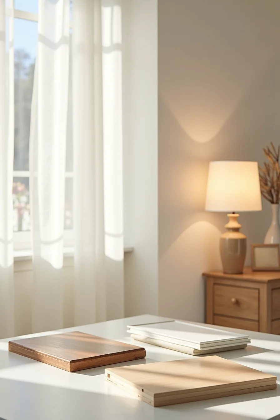
Your budget determines which of three distinct routes makes sense for your kitchen. Painting existing doors costs roughly $200–$600 in materials for a typical 10–14 door set, and a quality paint job with proper priming lasts 3–5 years before touching up. This route suits homeowners who want maximum color impact for minimal cash but can tolerate minor chips near hardware and edges, the painted wood door in this lineup shows exactly that wear pattern after two years of daily use.
The peel-and-stick laminate sample offers a renter-friendly alternative at $50–$150 per 10-square-foot pack, depending on finish quality. It adheres without damaging the substrate beneath and removes cleanly with a heat gun or hair dryer, restoring the original cabinet surface for your security deposit. Expect 1–3 years of durability in high-use areas; edges peel first near the dishwasher and sink where steam and heat accelerate adhesive breakdown.
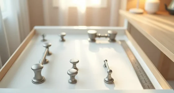
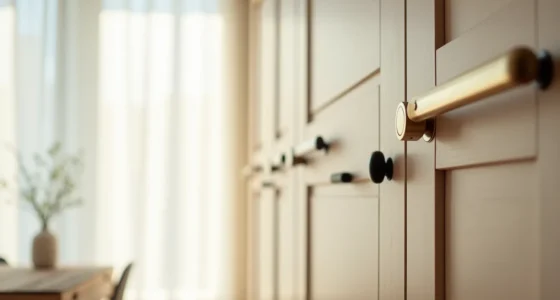
The solid custom cabinet door represents the investment tier: $500–$1,200 per linear foot installed, with factory-applied conversion varnish that resists yellowing and moisture for 10–15 years. The hardware samples beside it, brass knobs and matte black pulls, matter because custom finishes deserve fixtures that match their lifespan. Choose this route only if you plan to stay in the home for a decade or more; the cost premium rarely recovers at resale.
Your 30-minute decision shortcut
You now have six viable directions, each with distinct costs, maintenance loads, and visual payoffs. The real differentiator isn’t taste, it’s your timeline and tolerance for upkeep. Two-tone lowers hide wear; glossy lacquer demands constant wiping; matte paint chips visibly but touches up easily.
Start by walking through your kitchen with a notepad. Mark every surface that touches your hands daily, cabinet fronts, drawer pulls, the area beside the sink. That tells you which finish will survive your actual routines.
Then pick one wall, paint a 2×2-foot foam board sample, and lean it against your lower cabinets. Live with it for three days, observing it in morning light, afternoon sun, and evening shadows. If it still feels right on day three, that’s your color.
Order samples first, most paint brands offer 8-ounce test pots under $10, and the cost of indecision is far higher than the cost of paint.
Frequently Asked Questions
Should I paint my existing cabinets or replace them to change the color?
Paint if your cabinet boxes are structurally sound and you want to spend $200–$600 on supplies. Replace if doors are warped or layout changes are needed, expect $8,000–$20,000 for custom work.
What kitchen cabinet color works best with stainless steel appliances?
Mid-tone gray, navy, or warm white. These colors balance stainless steel’s cool metallic finish without competing for attention. Avoid stark white, which makes appliances look dull, and pure black, which creates harsh contrast.
How do I prevent light-colored cabinets from looking dingy after a few years?
Use a semi-gloss or satin finish with a stain-resistant topcoat, and wipe surfaces weekly with a mild soap solution. Install under-cabinet lighting to reduce shadow buildup, and avoid matte paints in high-traffic kitchens, they absorb grease.
Can I use kitchen cabinet color ideas to make a galley kitchen feel wider?
Yes. Paint upper cabinets a light color, soft white, pale sage, or light gray, and keep lowers slightly darker. Add vertical pulls and avoid horizontal grain patterns.
This creates visual height and reduces the tunnel effect.